Archives for posts with tag: pattern

We’ve seem many artistic mediums, but never something quite like this. Some of the most recent works by artist Dino Tomic (aka AtomiccircuS) resemble chalk, but its actually… wait for it… ordinary table salt. Based in Norway, by way of Croatia, Tomic painstakingly arranges salt granules in such away that he achieves stunning variations of tone, giving these incredible Game of Thrones portraits an incredibly realistic feel. His beautifully intricate mandalas are also pretty remarkable. There’s simply no denying Tomic’s gift of visualizing his compositions, then slowly building them with his bare hands. And his 270,000+ Instagram followers would surely agree. Try to refrain from yelling at your screen when you reach the 1:07 mark in the video below. Now you can’t say you weren’t warned.

Via Facebook

Tomic-01 Tomic-02 Tomic-03 Tomic-04 Tomic-05

Just this week, Uber unveiled a global rebranding that not only strayed a bit from its recognizable logotype, but also introduced a rather detached set of app icons. Can’t say that we suffered from extreme design envy over the previous Uber logotype, but it was fine. While their new logotype seems like a step in the right direction (thicker letterforms and tighter composition for maximum readability), the highbrow concept behind the app icons and larger identity seems rather misguided, and will surely be lost on most. Yes, Uber’s official statement references “bits and atoms” (“The unique aspect of Uber is that we exist in the physical world. When you push a button on your phone, a car moves across the city and appears where you are. We exist in the place where bits and atoms come together. That is Uber. We are not just technology but technology that moves cities and their citizens.”) In theory, the thought process behind the concept, which is customized identities for specific markets that aim to draw colors and patterns from “art, architecture, tradition, old and new fashion, textiles, the environment”, is a thoughtful one. But from a branding perspective, it seems to dilute the impact of the Uber brand as a whole. And that doesn’t even address that larger concern that the icon itself is not identifiable in any way as Uber. Though we had issues with the previous icon employing a dissimilar “U” letterform from the Uber logotype, at least it was just that, a letter U. This icon, or rather set of icons – one for riders, another for divers – make no effort to resemble the new Uber logotype in any way. Why abandon the “U”? Our view is not the basis of some pretentious design theory, but simple human nature. In our estimation, the biggest stumble here was not hiring branding experts for the task. We are not knocking in-house designers… they are often immensely talented with an invaluable familiarity and investment in a given brand. But this was surely not a 12+ months-long task meant to be spearheaded by a non-designer CEO. There are experts in the field who do this sort of thing, we are among them. We hear the cry among our peers: “Help us help you!” Sure, the presentation of Uber’s new identity is slick, but the principals behind the design concept as a whole indicate a lack of design leadership. An unfortunate case of just looking pretty, but not meeting a brand’s true potential.

Visuals via Uber


Before:

Uber-01

After:

Uber-02 Uber-03

New look. Same ride.

A video posted by Uber (@uber) on

Uber-04 Uber-05 Uber-06 Uber-07 Uber-08 Uber-09

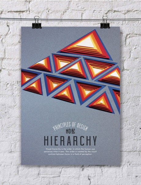
With school back in session, it seemed appropriate to feature some brilliant design work that’s education related. Turkish designer Efil Türk had the tall order of illustrating ten principles of design for her thesis project at Dokuz Eylul University of Fine Arts in İzmir, Turkey. These visual fundamentals — balance, hierarchy, pattern, rhythm, space, proportion, emphasis, movement, contrast, and unity — are truly universal. And Türk handles them in a really beautiful and effective way… with hand-cut paper, no less. We love Türk’s choice of colors and shapes, and her typography skills are not too shabby either. Türk is clearly very talented, we look forward to checking out her growing portfolio in the near future. More paper art posts here and here and here.

Via Tumblr and Instagram

Turk-01 Turk-02 Turk-03 Turk-04 Turk-05 Turk-06 Turk-07 Turk-08 Turk-09 Turk-10 Turk-11 Turk-12 Turk-13 Turk-14 Turk-15

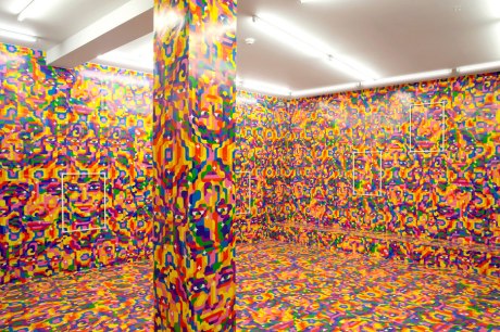
The creation of seamless patterns of complex wallpapers has always been sort of fascinating to us in general. Icelandic graphic designer Siggi Eggertsson takes this process to a whole other level with one of his latest projects, titled SKVÍS. The installation is actually a series of eight modular posters (for sale here) configured in many different combinations to create an overstimulating visual masterpiece (with some rather trippy undertones). From the exhibitor: “This beauty of infinity is always present in Siggi´s work. This may be related to methods for expanding ones mind, whether by use of substances or meditation as used by hippies to glimpse a different world which is not a reflection of our own world, but a world within. That world has godesses floating about, as can be seen in Siggi Eggertsson´s representation of a world few of us have visited.”

Via siggieggertsson.com and sparkdesignspace.com

Eggertsson-01 Eggertsson-02 Eggertsson-03 Eggertsson-04 Eggertsson-05 Eggertsson-06 Eggertsson-07

Local (as in Rochester, NY) artist Andy Gilmore creates mesmerizingly hypnotic geometric compositions. These are not pedestrian takes on kaleidoscopic views, but truly unique works of art. As revealed in the following (terrific) short video, Gilmore’s often complex pieces are inspired by the world around him, especially patterns in nature. His remarkable work has garnered international attention, partly due to his collaboration with Ghostly International. Gilmore’s impressive client roster includes Wired Magazine, The New York Times, Fast Company, Wallpaper* Magazine, Nike, among others. Keep him on your radar, we predict we’ll be seeing a lot more of his work proliferate through popular culture in the future.

Via crowquills.com and theghostlystore.com

Gilmore-01 Gilmore-02 Gilmore-03 Gilmore-04 Gilmore-05 Gilmore-06 Gilmore-07 Gilmore-08 Gilmore-09 Gilmore-10 Gilmore-11 Gilmore-12 Gilmore-13 Gilmore-14 Gilmore-15 Gilmore-16 Gilmore-17 Gilmore-18