Archives for the month of: September, 2014

We always appreciate inventive and surprising typography, and this is a great example by South African designer/illustrator Vus Ngxande. Handcrafted typography is a fantastic contrast to computer-generated graphics, and Ngxande’s execution works very well for this community outreach arm of South African retail giant Woolworths. Being the sole imagery in this 48-page booklet, the vibrant typography really pops. Well done.

More food-based typography here and here and here.

Via Behance

Ngxande-1 Ngxande-2 Ngxande-3 Ngxande-4 Ngxande-5 Ngxande-6 Ngxande-7 Ngxande-8

The art of quilling, a technique that involves rolling, shaping and gluing strips of paper to form decorative designs, has been around for literally hundreds of years. Russian-born, UK-based designer and artist Yulia Brodskaya has a masterful handle on the time-honored art form, and brings it into the twenty first century through use in advertising, publishing and even CandyCrush-inspired art and animated replicas of her work (seen here and here and here). Her three-dimensional work is vibrant, highly detailed and really thoughtfully crafted. Brodskaya explains her passion for paper in her own words, “Paper always held a special fascination for me. I’ve tried many deferent methods and techniques of working with it, until I found the way that has turned out to be ‘the one’ for me: now I draw with paper instead of on it”. Brodskaya’s reputation is unmatched, with an impressive list of clients to prove it.

More paper art posts here and here.

Via artyulia.com

Brodskaya-01 Brodskaya-02 Brodskaya-03 Brodskaya-04 Brodskaya-05 Brodskaya-06 Brodskaya-07 Brodskaya-08 Brodskaya-09 Brodskaya-10 Brodskaya-11 Brodskaya-12 Brodskaya-13 Brodskaya-14 Brodskaya-15 Brodskaya-16 Brodskaya-17 Brodskaya-18 Brodskaya-19 Brodskaya-20 Brodskaya-21

It’s not unusual for art and commerce to collide. But it’s certainly not always as awe-inspiring as this arresting piece from Vienna, Austria-based package designer and artist Gerlinde Gruber. Priding herself in creating “specialized packaging designs highly inspired by their contents”, Gruber is more intimately familiar with the intricacies of product packages than the average person. So it’s fitting that one of the world’s largest manufacturers of folding cartons, Mayr-Melnhof Packaging, commissioned Gruber to create a larger than life mural. Composed of more than 1,700 packages, this pseudo aerial view of a colorful cityscape is an exercise in color and form. Gruber also draws surprising parallels between packages and movies: “This model of an modern large city reminds us of the highly detailed city mock-ups which were made for such science fiction monster-movies, to be destroyed dramatically afterwards. Movies and packagings have many parallels. They pack contents to discover it to the maximum effect. Both are subject to trends, but always striking new paths to set trends by themselves. Brands and their products are showcased like movies and provoke customers emotions and reactions. The packaging is actor and stage at the same time. These cardboard boxes tell stories about the packaged product, such as houses talk about their residents.”

Via Behance

Gruber-01 Gruber-02 Gruber-03 Gruber-04 Gruber-05 Gruber-06 Gruber-07 Gruber-08 Gruber-09 Gruber-10 Gruber-11 Gruber-12

Celebrity portraiture is a fascinating niche. We love seeing another side of these familiar (and often admired) individuals. Chicago-based photographer Sandro Miller had something else in mind when he recently collaborated with acclaimed actor John Malkovich. Rather than capturing the essence of Malkovich himself (which Miller has done in the past), the project Malkovich, Malkovich, Malkovich: Homage to Photographic Masters, as the name suggests, explores photographers whose photographs helped shape Miller’s career. This project is not only evidence of Miller’s amazing photography skills through the full recreation of iconic photographs without the use of Photoshop editing, but also Malkovich’s stellar acting capabilities, transforming himself into these familiar subjects. Miller expresses his esteem for Malkovich in his own words “John is the most brilliant, prolific person I know. His genius is unparalleled. I can suggest a mood or an idea and within moments, he literally morphs into the character right in front of my eyes. He is so trusting of my work and our process… I’m truly blessed to have him as my friend and collaborator.”

Via sandrofilm.com and edelmangallery.com

Sandro-01 Sandro-02 Sandro-03 Sandro-04 Sandro-05 Sandro-06 Sandro-07 Sandro-08 Sandro-09 Sandro-10 Sandro-11

Simpsons fan or not, this massive replica of Springfield is utterly impressive. No kit or instructions here for Illinois-based master Lego builder (and fellow graphic designer) Matt De Lanoy. This Simpsons super fan and Lego lord exhibits an incredible attention to details with these colorful bricks. From Krusty Burger to Moe’s Tavern, Kwik-E-Mart to Ned Flanders’ house, De Lanoy managed to build some of the most recognized landmarks featured in the animated series’ famed history, now going into its 26th season. More Lego posts here and here and here.

Via Flickr

DeLanoy-01 DeLanoy-02 DeLanoy-03 DeLanoy-04 DeLanoy-05 DeLanoy-06 DeLanoy-07 DeLanoy-08 DeLanoy-09 DeLanoy-10 DeLanoy-11 DeLanoy-12 DeLanoy-13 DeLanoy-14 DeLanoy-15 DeLanoy-16


Infographics, by design, are meant to present complex information quickly and clearly. And given our ever shortening attention span (digesting information in the form of Tweets, texts, etc.), the proliferation of infographics is upon us. Munich-based design studio Kurzgesagt (German for “in a nutshell“) is particularly adept at breaking down information and presenting it in an engaging and comprehensible fashion. When applied to traditional cornerstones of education like the solar system, or even current topics of interest like fracking or the situation in Iraq, infographics from Kurzgesagt, led by Philipp Dettmer and Stephan Rether, are able to inform and captivate in extraordinary ways. Kurzgesagt says it best when describing their terrific piece The Solar System: Our Home in Space: “The solar system – well known from countless documentaries. 3D animation on black background. This infographic videos tries something different. Animated infographics and a focus on minimalistic design puts the information up front. We take the viewer on a trip through the solar system, visiting planets, asteroids and the sun.” This piece should be a primer for all secondary school-aged students when learning about basic astronomy. From a design perspective, their sense of typography and color, as well as their use of flat animation, are spot on. Be sure to check out their piece on Iraq… we certainly learned a thing or two.

Via kurzgesagt.org

Kurzgesagt-01 Kurzgesagt-02 Kurzgesagt-03 Kurzgesagt-04 Kurzgesagt-05 Kurzgesagt-06 Kurzgesagt-07 Kurzgesagt-08 Kurzgesagt-09 Kurzgesagt-10 Kurzgesagt-11

Creating an original typeface is no easy feat. And one that is animated, engaging and thematically relevant to the concept at hand? You guessed it… tremendously challenging. Madrid-based designer/art director Noelia Lozano has created one such design for a project entitled Curiosity is the Key. Lozano worked in collaboration with The Poool magazine, part of the OFFF Festival 2014, an international festival held in Barcelona every year that attracts offline/online designers, motion designers, thinkers, sound designers, graphic designers, theorists, developers, professionals, students (basically curious creative types). Noelia was given the magazine statement, along with the theme, and off she went: “We hate expectations. We are bigger than reality. We want to dive in what’s behind the real world. Dive deeper with what we want to know without expecting it. The Poool is the place to be, it is your escape, your answer, and the feeling of scratching your itchiness.” In her own words, Lozano explains: “My work is in relation to that which helps me to keep working every day …curiosity.”

Via noelialozano.com

Lozano-01Lozano-19Lozano-20 Lozano-21Lozano-22Lozano-02 Lozano-03 Lozano-04 Lozano-05 Lozano-06 Lozano-07 Lozano-08 Lozano-09 Lozano-10 Lozano-11 Lozano-12 Lozano-13 Lozano-14 Lozano-15 Lozano-16 Lozano-17 Lozano-18

<p><a href=”http://vimeo.com/95064983″>CURIOSITY IS THE KEY</a> from <a href=”http://vimeo.com/user4948198″>NOELIA LOZANO</a> on <a href=”https://vimeo.com”>Vimeo</a&gt;.</p>

Fashion draws inspiration from a wide array or sources. And art certainly draws from fashion in much the same way. This cyclical phenomenon is evident in this terrific series by French duo Thomas Couderc and Clément Vauchez, otherwise known as Helmo. Aptly titled “Bêtes de mode” (Fashion Animals), each piece depicts a fashion model in blue, with a thematically complimentary animal superimposed in red. The series has been on display in the windows of iconic upscale Paris department store Galeries Lafayette on Hausmann Boulevard. To capitalize on the duotone effect, the installation featured colored gels to reveal just the model portrait or animal portrait, depending on which one the viewer looked through. This technique is sort of reminiscent of those old school 3D glasses, with the red and blue lenses. Just brilliant. Get the full effect through the video below..

Via helmo.fr

Helmo-01 Helmo-02 Helmo-03 Helmo-04 Helmo-05 Helmo-06 Helmo-07 Helmo-08 Helmo-09 Helmo-10 Helmo-11

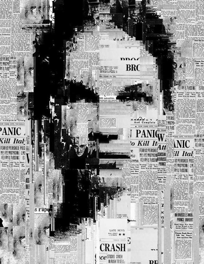
Collage work, though we’ve all created some form of it from an early age, is way more difficult than it looks… especially at a masterful level of fine art. Barcelona-based artist Sergio Albiac is one such master, who marries traditional media and generative computer code in unexpected ways. Albiac’s series “You are not in the news” explores the relationship between self-worth and media exposure. These compositions are striking, to say the least. And a glimpse into Albiac’s process makes them that much more special. In his own words: “When I code a generative sketch, I introduce control (the sentences that govern the sketching action) and also a degree of randomness in the code. This is a machine control/randomness balance. Then, I select certain outputs (again, human control) and I paint a canvas using the selected generative images as an starting point, without the aim of exact reproduction. The act of painting is a struggle between control and randomness because, depending of the painting technique, paint behavior cannot be totally controlled by the painter. In this way, I explore a fascinating “dialogue” between control/randomness and machine/human interaction. It makes sense to me. I feel connected to artistic tradition but using the generative sketchbook process, I can create in a very contemporary and innovative way that deeply reflects the ideas I need to express.” Just brilliant

Previous post about a very different approach to generative art here. And more collage work here.

Via sergioalbiac.com

Albiac-1 Albiac-2 Albiac-3 Albiac-4 Albiac-5