Archives for category: Architecture

Graffiti as we know it is a little less radical these days, much to the disappointment of some. Now sometimes referred to as street art, it has been elevated to just that: art. And with this new cultural regard comes greater exposure. We recently stumbled upon the work of Portuguese artist Sergio Odeith thanks to said exposure, and there is no doubt that his skills are highly artistic, “street” or otherwise. Odeith plays with our minds with his large-scale anamorphic creations he likes to call “sombre 3D”. His sense of space and perspective are astounding, with flawless artistic skills to match. Some of his works are straight up creepy, but that’s probably the point.

More street art posts here and here and here.

Via odeith.com and Instagram


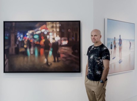
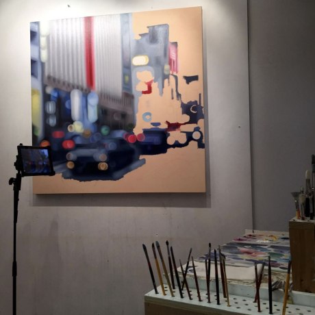
We always find it interesting when artists figuratively blur the lines of media, and in this case literally. The work of South African artist Philip Barlow appears to be one thing but is actually another, and we are utterly intrigued. What looks like beautifully composed out-of-focus photographs are actually masterfully created oil paintings. Barlow focuses (no pun intended) on the interaction of light with his subjects, and the results are quite stunning. In his own words, “The figures in the landscape serve as carriers and reflectors of the light that falls upon them. Bathed in the luminosity, it is my hope that they would become more beautiful. To me, light is the ultimate subject because it embodies the pinnacle of all reality.” In works where the details are not at all sharp, we are taken with Barlow’s astounding attention to detail. The soft edges and bokeh effect are quite beautiful, and Barlow’s deep understanding of color is an artistic revelation. We are in awe.

Via philipbarlow.com and Instagram

At one time or another, we’ve all experienced the satisfaction of a perfectly timed photo. Being in the right place at the right time can be everything. Just ask Missouri-bred, New York-based photographer Jonathan Higbee, who capitalizes on those moments in his outstanding series “Coincidences.” Described as his “love letter to New York, and to the infinite number of magical, ephemeral and serendipitous moments that make it a city unlike any other,” Higbee credits his awe-inspiring collection of moments to exploring the streets of the Big Apple for over a decade. In his own words, Higbee explains, “This work explores the relationship city dwellers share with their chaotic, demanding urban environments. The pervasive and growing sources of overstimulation (giant glowing advertisements, traffic sounds, odors from food carts, etc.) all fight for the precious attention of passersby. “Coincidences” attempts to stabilize this instability and reveal the uncanny stories that arise when the crush of urban discord experiences brief moments of harmony.” Higbee’s work is harmonious, indeed… striking all the right chords from masterful composition to that element of surprise and delight, and often humor. Keep an eye out for Higbee’s forthcoming book featuring never before seen work!

Via Instagram

Imagine a post-apocalyptic world where social media companies are no longer the powerhouses they are today, but rather crumbling relics from the past. That’s exactly what self-taught Romanian digital artist Andrei Lacatusu envisioned when conceiving his arresting series Social Decay. Not only is Lacatusu’s technical skill amazing, but we love the concept, which flies in the face of all we know to be true at this present moment. And that’s what makes this series so striking. These logos, including Facebook, Google, and Instagram, are slick, closely curated marks that sort of define the current era. So to see them dilapidated, weather-worn and abandoned forces a double take, especially at this level of realism. Lacatusu’s perspective is provocative and timely, elevating this series well beyond a masterclass in CGI.

Via Behance


As we’ve mentioned before, we occasionally have a lapse of design envy. It doesn’t happen too often… after all, we are a pretty terrifically creative bunch here at Barbour. But sometimes we encounter work that is just so damn brilliant. So good, in a “why didn’t we think of that?” sort of way, that we have to concede our envy publicly (in a good way, of course). In this instance, it’s the illustrious work of New York-based designer and letterer Nick Misani. Though we are absolutely taken with Misani’s entire stunning body of work, we are particularly impressed with his ongoing Fauxsiacs series. Here, Misani hones his stellar lettering skills in the context of realistic mosaic illustrations to great effect. Misani’s work is clearly historically influenced, with a modern twist, and it’s no surprise that he has worked with design icon Louise Fili, perhaps the highest compliment. We will be keeping an eye on this series, which features destinations from around the world. The possibilities are endless, and hopefully coming to a city near you! Prints available here.

Via fauxsaics.com and Instagram
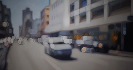
Posters are some of our favorite, yet challenging, projects. Poster design is a marriage between visual aesthetic and the delivery of information, between textual and graphical elements… the very fundamentals of graphic design. It should come as no surprise, then, that an institution as important and influential as the New York Film Festival places great emphasis on this visual embodiment of its annual event. Festival organizers manage to recruit some truly respected artists and photographers year after year for its remarkable posters. Below is just a sampling, starting with this year’s by renowned sculptor Richard Serra.

Via nytimes.com

Our penchant for serial works never diminishes. There’s just something about the natural order of things that is so satisfying. Glasgow-based illustrator/designer Jack Daly taps into that systemization while exploring his love of illustration, typography, and travel with his aptly titled Wanderlust Alphabet. And we have to say, the results, so far, are pretty great. It goes without saying that Daly is a terrific artist, and his adept use of color and sense of composition really make each of these pieces sing. Having just tackled the very beginning of the alphabet so far, Daly differentiates each letter/city with signature landmarks, architecture, local customs, etc. We are really taken with Daly’s style and cannot wait to see this alphabet grow. The possibilities are endless! In the meantime, prints available here.

Via Behance and Instagram

Australian photographer James Popsys has some serious skills behind both the lens and his MacBook Pro, but his work is anything but serious. Popsys is not one to indulge in self-importance or highbrow projects but rather focuses on manipulating scenes from everyday life into playful, sometimes ironic works. That’s not to say his approach is not conceptual or smart… Popsys just can’t help but inject his subversive sense of humor into his surreal photographs. In these globally solemn and often humorless times, Popsys’s work is refreshing. Keep it coming.

Via jamespopsys.com

popsys-01 popsys-02 popsys-03 popsys-04 popsys-05 popsys-06 popsys-07 popsys-08 popsys-09 popsys-10 popsys-11 popsys-12 popsys-13

A lot has happened in the world since we last visited the quirky and thought-provoking work of Atlanta-based BBDO Creative Director Stephen McMennamy. Yet his steadfast #ComboPhotos project continues to churn out clever mashups and engage people around the globe. In fact, as cited in our previous post (here) back in September 2015, he had almost 50K Instagram followers… well, his following has ballooned to 226K and growing. And for good reason. His compositions, which are all comprised of original, thoughtfully captured photography (rather than stock images) are simple and fun. Their brilliance is in their subtlety, and also the purposeful absence of Photoshop blending tools. McMennamy’s work makes us do a double-take, which is a sure measure of something special in our minds. His work is as impressive as ever… can’t wait to check back in another 16 months to see what McMennamy has conjured up.

Via Instagram

mcmennamy-01 mcmennamy-21 mcmennamy-20 mcmennamy-19 mcmennamy-18 mcmennamy-17 mcmennamy-16 mcmennamy-15 mcmennamy-14 mcmennamy-13 mcmennamy-12 mcmennamy-11 mcmennamy-10 mcmennamy-09 mcmennamy-08 mcmennamy-07 mcmennamy-06 mcmennamy-05 mcmennamy-04 mcmennamy-03 mcmennamy-02

Welp, UK designer/illustrator/artist Christopher LaBrooy has done it again. His mad CGI skills continue to amaze us. LaBrooy is a master manipulator, creating surreal digital compositions that defy logic and reason (previous posts here and here). Aptly titled simply 911, and set in what appears to be picturesque Palm Springs, LaBrooy pays homage to the iconic 1973 Porsche 911 Carrera RS in this incredible series. What we love most about LaBrooy’s work is that he elevates his adeptness in Maxon Cinema 4D beyond gratuitous rendering for the sake of rendering, to thoughtful and awe-inspiring artwork. Gearheads may shudder at the sight of a dozen otherwise pristine Porches partially submerged in a pool, but that’s precisely what LaBrooy seems to strive for: an emotional response to his digital work. As far as we’re concerned, mission accomplished (again).

Via chrislabrooy.com

labrooy-01 labrooy-02 labrooy-03 labrooy-04

labrooy-05 labrooy-06