Archives for the month of: September, 2016

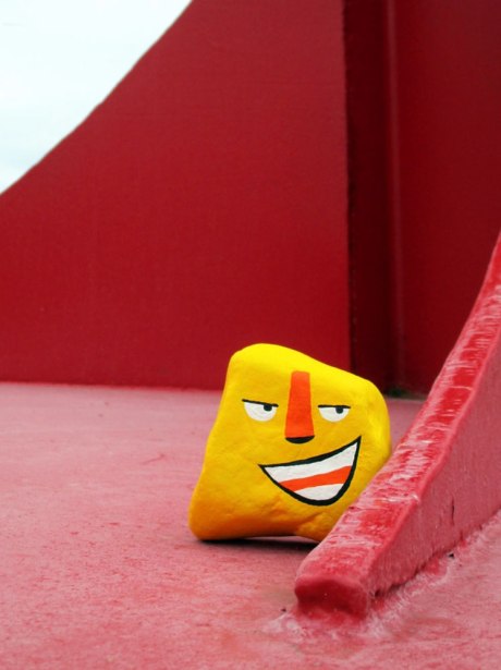
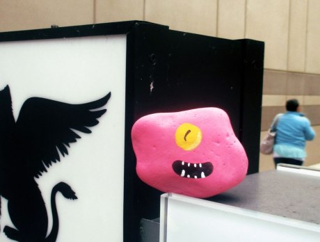
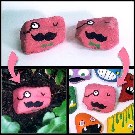
Painting rocks is a favorite pastime of many, but Michigan artist/illustrator/designer/author/educator Aaron Zenz has taken it to a whole other level. In preparation for what is now known as the “most-attended public art event on the planet”, ArtPrize in Grand Rapids, Michigan (happening right now), Zenz and his six children collected and painted over 1,000 rocks over the course of a year. Zenz describes the project in his own words: “I painted them 7 solid base colors, representing myself and my six children. I invited these family members to fill the rocks with any kind of faces they wanted. All the rocks were painted in matching pairs. I took half of the rocks, 500, and arranged them outside the Children’s Museum in a sprawling display, creating a kaleidoscope of colors, shapes, and patterns. I took the other matching 500 rocks and hid them all over Grand Rapids in random locations. As your family enjoys the day at ArtPrize, keep your eyes open! You will notice details of GR streets like never before. How many of the 500 hidden rocks can you spot? Who in your party has the quickest eyes? When you spot one, leave it where it is and snap a photo. View and share photo discoveries on social media with the hashtag #RockAroundGR to get the complete community building experience.” What a fantastic undertaking on so many levels. With all the often somber headlines lately, this home-grown, positive interactive art experience is certainly a welcome highlight. We only wish it was closer! Think of it as a Stone Age Pokémon GO.

Via artprize.org

zenz-01 zenz-02 zenz-03 zenz-04 zenz-05 zenz-06 zenz-07 zenz-08 zenz-09 zenz-10 zenz-11 zenz-12 zenz-13 zenz-14 zenz-15 zenz-16

We’ve seen many reinterpretations of Disney characters and themes over the years (here and here and here), but nothing quite like Las Vegas-based painter Heather Theurer’s take. Theurer, who surprisingly doesn’t have a formal art education, takes it well beyond simply fan art. Her skill set and techniques are rooted in fine art, more specifically Renaissance painting, consisting of “a multitude layers of paint and glazes (as many as 20 or so in some cases) to reach the desired depth and detail that dominates her work.” Self-taught or not, Theurer creates some gorgeous work that has actually been commissioned by the big cheese, Disney, which is undoubtedly a great source of pride and validation. With such a deep catalog of characters and stories from which to draw, the possibilities for Theurer’s incredible series are endless.

Via heathertheurer.com

theurer-01 theurer-02 theurer-03 theurer-04 theurer-05 theurer-06 theurer-07 theurer-08 theurer-09 theurer-10 theurer-11

Fresh on the minds of Americans in this spirited election season, and following last night’s first presidential debate, Donald Trump has firmly cemented his Q Rating (whether favorable or not) into the public consciousness. It should come as no surprise, then, when artwork reflects current affairs (related posts here and here). We’ve discussed the awesome and thought-provoking work of Brazilian artist Butcher Billy not long ago (here), and thought it fitting to share his recent series featuring Trump. Butcher Billy’s skill is clear, and this homage to Belgian surrealist René Magritte, aptly titled Trump X Magritte: The Surrealist Series, draws on his keen sense of color and composition. As Butcher Billy says himself, “Because nothing is more surreal than The Donald.”

Via Behance

butcherbilly-01 butcherbilly-02 butcherbilly-03 butcherbilly-04 butcherbilly-05 butcherbilly-06 butcherbilly-07 butcherbilly-08 butcherbilly-09 butcherbilly-10 butcherbilly-11 butcherbilly-12

We feel one of our fundamental responsibilities as designers is to employ our creative resources to help communicate and disseminate messages for public good, when possible. The right visuals can be powerful and in this instance, also quite beautiful. Commissioned by German environmental advocacy group Robin Wood, ad agency Grabarz & Partner collaborated with some clearly talented folks from Berlin to Bangkok to create this compelling series of advertisements illustrating the destruction of nature and wildlife around the world. Anchored by a clever concept, the execution here is spot-on. With the use of double exposure (other examples here and here), these compelling ads feature an animal and its natural habitat threatened by destruction. We love the composition and endless details of each piece. Just excellent all around.

Via Behance

grabarz-01 grabarz-02 grabarz-03 grabarz-04 grabarz-05 grabarz-06 grabarz-07 grabarz-08

Denver-based artist Jaime Molina has a very specific aesthetic. Clearly influenced by folk art, Molina’s work seems to be part of a larger narrative, complete with characters and such. We love it all, but are really taken with his 3D sculpture work, which has a whimsical, yet rustic feel. We particularly love how Molina uses nails to form the hair of his bearded characters. Though the nails are of varying sizes and seem to be placed almost haphazardly, there’s also a uniformity that’s really intriguing. Some of these intricate pieces even open to reveal a sort of center “skull”. Awesome work, so imaginative.

Via cuttyup.com and Instagram

molina-01 molina-02 molina-03 molina-04 molina-05 molina-06 molina-07 molina-08 molina-09 molina-10 molina-11 molina-12 molina-13 molina-14 molina-15 molina-16 molina-17 molina-18 molina-19 molina-20 molina-21 molina-22 molina-23

With the latest Apple releases, so too will come the flood of YouTube videos of folks “testing” the new devices in all sorts of precarious scenarios (submerging your new iPhone in a vat of soda, then freezing it for 12 hours, anyone?). New Zealand-born, Brooklyn-based photographer/artist Henry Hargreaves (whose stellar work we’ve discussed here and here) takes a more cerebral approach to a practice that is no less cringe-inducing to us gadget geeks. Hargreaves, along with his stylist partner Caitlin Levin, whose incredible collaborations almost always employ food as the medium, juxtaposes said electronic devices with fast food in their series Deep Fried Gadgets. While we do shudder slightly at the sight of intentionally defacing these gizmos that we hold in such high regard, we certainly appreciate the concept and commentary, not to mention the fascinatingly engaging visuals. In Hargreaves’s own words, “I like to play with food and the juxtaposition of different worlds. I found a video of some Japanese kids trying to deep fry a PSP and eat it, it didn’t work and they made a mess of it, but I loved the idea and thought it could be expanded and photographed in a beautiful way. Electronics have become almost a holy device, the way a new apple device sends people out of their minds. But as soon as the next model comes out the last is immediately forgotten. This is a commentary about the similarities between tech culture and fast food. Quickly devoured and then discarded because of our appetite for the newest product.”

Via hargreavesandlevin.com

hargreaves-01 hargreaves-02 hargreaves-03 hargreaves-04 hargreaves-05 hargreaves-06 hargreaves-07 hargreaves-08

It’s no secret that we’re fascinated by “365 projects” and the dedication they reveal (previous posts here and here and here). Done well, these daily doses of artistry not only help develop a robust portfolio, but also serve as an exercise in on-demand creativity… a must in the field of graphic design, as we know all too well. And Nebraska-based designer/illustrator Ian Simmons tackled his serial project expertly. We are in awe of not only the diversity of his work, but the sheer quality of his typography. Clearly a movie buff at heart, Simmons masterfully depicted a wide variety of film quotes through illustration and typography, for 365 days straight (actually, 366)! Yes, an entire year. Just incredible. This is just a sampling of a few of our favorites, but be sure to check out his Instagram for the complete collection. He even sells select prints (here).

Via Instagram

simmons-01 simmons-02 simmons-03 simmons-04 simmons-05 simmons-06 simmons-07 simmons-08 simmons-09 simmons-10 simmons-11 simmons-12 simmons-13 simmons-14 simmons-15 simmons-16 simmons-17 simmons-18 simmons-19

Pointillism, a painting technique in which distinct dots of color are applied in patterns to form an image, dates back some 130 years, though the technique is actually analogous to four-color CMYK printing process and RGB displays we designers are all too familiar with. Some of the most notable artists who have employed this technique are van Gogh and Seurat, but the art movement was relatively brief. But contemporary South African artist Gavin Rain makes a great case for bringing it back. Rain seems to have mastered the complex technique, as exhibited in his stellar body of work. In his own words, Rain explains that he developed his style “from the need to tell a story – to present a perspective. I usually dislike art that doesn’t communicate anything. I also hate it when I’m viewing art and I don’t know the message. I wanted to avoid that – everyone has to get my message – which is to step back.” We imagine Rain’s layering process takes quite some time, but the result is absolutely breathtaking. His unique perspective, and ability for visual conveyance, is just incredible.

Via gavinrain.com

rain-01 rain-02 rain-03 rain-04 rain-05 rain-06 rain-07 rain-08 rain-09 rain-10 rain-11

When we stumbled upon the work of Florida-based painter Matthew Cornell, we were really taken with his uncanny ability to paint water so realistically. But as we delved deeper into Cornell’s body of work, particularly his series entitled Pilgrimage, we realized there was much more to this talented artist. Sure, he has tremendous skill for painting in a realistic fashion, but there’s an emotional connection that one rarely captures in hyperrealism (some examples here and here and here). There’s something ethereal about Cornell’s work that transcends simply replicating a scene so well that it could be mistaken for a photograph. Perhaps it’s his own connection that comes shining through, but Cornell has a way of conveying real emotion with the notable absence of people. And we imagine this connection is even greater when viewing his extraordinary work in person. Don’t miss the trailer below to a solo exhibition last year.

Via matthewcornell.com

cornell-01 cornell-02 cornell-03 cornell-04 cornell-05 cornell-06 cornell-07 cornell-08 cornell-09 cornell-10 cornell-11 cornell-12 cornell-13 cornell-14 cornell-15

Few automotive designs are as iconic as the Volkswagen Beetle. Dubbed the “people’s car”, Volkswagen has gone on to produce some 22 million units, making the Beetle the longest-running and most-manufactured car of a single platform in history. Indonesian sculptor Ichwan Noor capitalizes on the Beetle’s recognizability with his striking Beetle Sphere and Beetle Box sculptures. Noor’s body of work is comprised of a good deal of pieces that focus on man-made transportation, so it’s really no surprise that he chose to morph the unmistakable VW for these particular works. Though these sculptures are not simply warped car bodies, Noor certainly creates that illusion. Instead, he relies on authentic and fabricated parts… crafting cast metal components, and thoughtfully displaying some of the car’s most recognizable features. Quite a feat, considering these are not computer generated (like these), but physical objects. Wow. The result is really something to behold.

Via ichwannoor.com and Wikipedia

noor-01 noor-02 noor-03 noor-04 noor-05 noor-06 noor-07 noor-08 noor-09 noor-10 noor-11 noor-12 noor-13 noor-14 noor-15 noor-16