Archives for category: Icons

Given the late breaking, historical news that a NASA probe, launched some nine and a half years ago, and traveling an astounding 3 billion miles, has finally reached Pluto just hours ago, we thought it fitting to showcase this series of custom astronomy logos by Berlin-based designer Jonas Söder. We love Söder’s style here, sort of giving a nod to sci-fi graphics of the 1950s, but with a modern twist. His use of texture is quite nice, with a clear typographical prowess, as demonstrated by his custom letterforms. Out of this world, indeed.

Via Behance

Soder-01 Soder-02 Soder-03 Soder-04 Soder-05 Soder-06 Soder-07 Soder-08 Soder-09 Soder-10 Soder-11 Soder-12 Soder-13

Balancing work and family is an issue close to our hearts. The culture at Barbour fosters this balance brilliantly, so we listened intently when Amanda Altman of Rochester-based A3 Design took the stage at Create Upstate (see related posts here, here and here) last week. Her speech, entitled Mind My Own Business, explored the ins and outs of Altman’s experiences of not only running, but also refocusing and repositioning, a design studio with her husband, Alan. And all while juggling the demands of marriage and family. We were taken with Altman’s sincerity and candor on a subject that’s not often brought to the forefront. If her articulation was any indication, Altman could honestly have a second career as a life coach for creatives. If we had to choose a highlight, this frank pearl of wisdom pretty much sums it up: “Do what you love and you’ll never work a day in your life… bullshit!”

Altman made a smart choice to show “pretty pictures” of A3’s outstanding body of work while speaking (scroll down for a sampling). Needless to say, the Altmans seem to be balancing masterfully. Really well done.

Via a3-design.com

A3-01 A3-02 A3-03 A3-04 A3-05 A3-06 A3-07 A3-08 A3-09 A3-10 A3-11 A3-12 A3-13 A3-14 A3-15 A3-16 A3-17 A3-18 A3-19 A3-20 A3-21 A3-22 A3-23 A3-24 A3-25 A3-26 A3-27 A3-28 A3-29 A3-30

Let’s face it, emojis have infiltrated the general consciousness. When your mom is using them, you know they’ve hit the mainstream. These small digital images used to express an idea, emotion, etc., in electronic communication are now becoming the subject of art itself, which is another touchstone of cultural proliferation. Wildly talented Toronto-based letterer/designer/artist Christopher Rouleau has created a typographic set of letterforms using these tiny icons in fantastic ways. They are not simply cobbled together haphazardly, but thoughtfully constructed to reveal a variety of nuances in unexpected ways. For one, the emojis used start with the letter they are creating. We love Rouleau’s out-of-the-box thinking. He rolled out the set, one-by-one via his Instagram recently. Rouleau is no one hit wonder… be sure to check out his body of terrific work here.

Via Instagram

Rouleau-01 Rouleau-02 Rouleau-03 Rouleau-04 Rouleau-05 Rouleau-06 Rouleau-07 Rouleau-08 Rouleau-09 Rouleau-10 Rouleau-11 Rouleau-12 Rouleau-13 Rouleau-14 Rouleau-15 Rouleau-16 Rouleau-17 Rouleau-18 Rouleau-19 Rouleau-20 Rouleau-21 Rouleau-22 Rouleau-23 Rouleau-24 Rouleau-25 Rouleau-26

Given the abundance of fonts out there (many of which are often free), one would think that the tradition of lettering would be dead. But similar to the rise of vinyl in music these days, the opposite is actually true. Lettering is experiencing a sort of renaissance in the design community. Call it novelty or nostalgia, but there is something very special about lettering, especially in this era of (and we don’t particularly like this term) desktop publishing. Styles run the gamut, and we have an appreciation for the great variety of lettering work currently being done. We are particularly fond of London-based freelance digital letterer and illustrator Linzie Hunter. Her colorful, whimsical style has served an impressive list of clients very well. Those clients include New York Observer, Washington Post, Random House Publishing, Harper Collins, Scholastic, Hallmark, American Girl, Time Magazine, Wall Street Journal, Nike, and many more. Hunter’s work is really quite something… she has a distinct ability to make a heap of information engaging, and even beautiful. And her illustrations are fantastic too. What a talent!

Via linziehunter.co.uk

Hunter-01 Hunter-02 Hunter-03 Hunter-04 Hunter-05 Hunter-06 Hunter-07 Hunter-08 Hunter-09 Hunter-10 Hunter-11 Hunter-12 Hunter-13 Hunter-14 Hunter-15 Hunter-16 Hunter-17 Hunter-18 Hunter-19 Hunter-20 Hunter-21 Hunter-22 Hunter-23 Hunter-24 Hunter-25 Hunter-26Hunter-27 Hunter-28 Hunter-29 Hunter-30

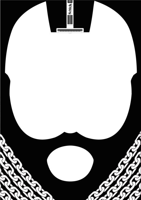
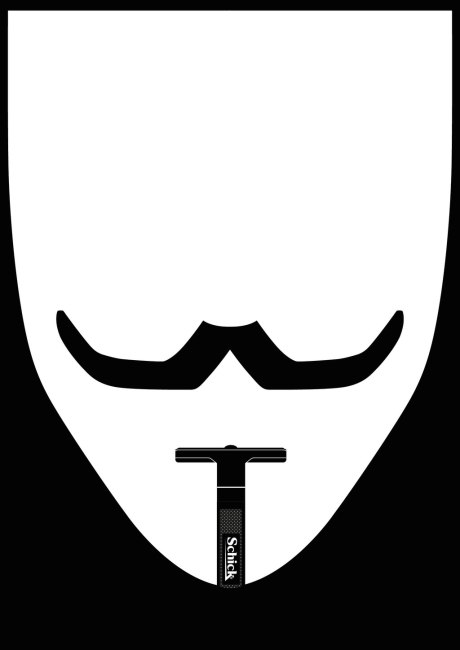
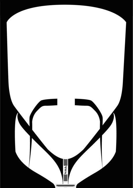
There’s an old adage that states “less is more.” And that maxim certainly holds true for this minimalist icon set developed for Schick. There was a notion in the Philippines that Schick was a female brand because of their popular line of lady razors, so the Manila branch of marketing and advertising giant J. Walter Thompson developed this slick set of graphic posters to combat that misperception. These fantastically bold graphics, by the team at JWT Manila, feature recognizable historical and pop culture figures with distinct facial hair (Mr. T from The A-Team, V from V for Vendetta, Salvador Dali, Groucho Marx and Charlie Chaplin) that one can achieve using Schick razors. We love how the product is seamlessly integrated into the designs. There’s certainly market research and number crunching that goes into how and where to market with visuals like these, but we don’t see why a campaign like this wouldn’t be effective here in the US. There seems to be a sort of facial hair renaissance happening right now, and aggressively bold visuals like these would be hard to miss.

Via jwt.com

JWT-1 JWT-2 JWT-3 JWT-4JWT-5

BARBRAIN

The folks at Brooklyn-based Pop Chart Lab have done it again. Their proficiency for infographical treatments is astounding, no matter the subject matter. Whether it be a “Visual Compendium of Guitars” or “Cartography of Kitchenware” or any number of alcohol-related compositions (think “The Marvelous Mixology of Martinis”, “Fantastical Fictive Beers”, “Wineries of Napa”, etc.), the work of Pop Chart Lab never disappoints. It’s like a master class in infographics. And they have finally given such treatment to the very core of their passion: the history of graphic design. This 18” x 24” hand-illustrated diagram (available for preorder at a limited-time discounted price here, to start shipping tomorrow) is not only a decorative piece, but also an invaluable go-to quick visual reference of the most important eras in graphic design. Pop Chart Lab’s team of researchers and designers did a fantastic job of capturing the essence of each style in such a compact, efficient manner. This will be hanging on our walls real soon.

Via popchartlab.com

P-GraphicDesign_429_e PopChartLab-2 PopChartLab-3 PopChartLab-4 PopChartLab-5

You may have caught wind of this brilliant design exercise, Football as Football, that’s slowly gaining popularity online. It’s a labor of love for six Minneapolis-based creative professionals who share three common interests: American football, soccer and design. The concept is actually simple… reimagining NFL team logos as European soccer club badges. But we know that’s not as easy as it sounds. The very capable (and creative) hands of this design team are pulling it off beautifully. Their goal is to create and release four sets of 32 logos over the course of the American football season. Looking awesome so far, we will continue to follow their progress.

Via footballasfootball.com

FAF-1 FAF-2 FAF-3 FAF-4 FAF-5 FAF-6 FAF-7 FAF-8 FAF-9

London-based illustrator/designer Federica Bonfanti designed this bucket list, of sorts, of places to visit before you die (complete with checklist to keep score). What catches our eye here is just how well rounded this piece is. The level of detail Bonfanti achieves in each “badge” is really something. Her keen eye for typography is spot-on, capturing some personality of each city. Each “badge” can certainly stand on its own (and some are actually for sale as individual prints). And her sense of color is also notable. Great piece any way you slice it… very inspiring.

Via federicabonfanti.com

Bonfanti-1 Bonfanti-2 Bonfanti-3 Bonfanti-4 Bonfanti-5 Bonfanti-6 Bonfanti-7 Bonfanti-8