Archives for the month of: October, 2014

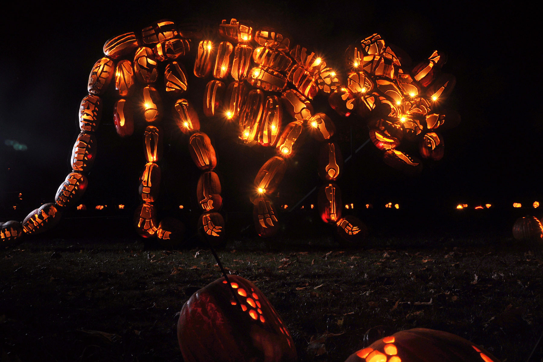
Pumpkin carving can really be an art. It seems that over the past few years, the bar has been raised. The traditional jack-o’-lantern has given way to intricate masterpieces. RISE of the Jack O’Lanterns is a consortium of expert carvers who join efforts to put on incredible displays of over 5,000 hand-carved illuminated jack-o’-lantern in New York and Los Angeles around this time each year. These gorgeous gourds feature carvings that depict everything from deceased celebrities to dinosaurs, video games to venomous snakes, fictional characters to fantastic “underwater” displays. Some take a few minutes, others take up to 20 hours, and, as magical as it all looks, they have not figured a way to keep the pumpkins from rotting… they replace them weekly as needed. Wow!

Via therise.org

Rise-01 Rise-02 Rise-03 Rise-04 Rise-05 Rise-19Rise-06 Rise-07 Rise-08Rise-18 Rise-09 Rise-10 Rise-11 The Rise of the Jack o Lanterns - La Canada Flintridge Rise-20Rise-13 Rise-14 Rise-15 Rise-16 Rise-17

One sign of a gifted photographer is finding beauty in mundane, everyday subjects. Take popular aquarium “betta” fish (otherwise known as Siamese fighting fish), for example. Sure, they’re lovely domestic pets, but Thai photographer Visarute Angkatavanich captures them in all their beauty and elegance like we’ve never seen before, despite their rather aggressive nature (hence their name). Through Angkatavanich’s lens, they look exotic and mysterious. A commercial photographer by trade, Angkatavanich decided to experiment with shooting these colorful cold-blooded vertebrates a few years ago on a whim. And the results are truly stunning. We love how they appear to be suspended in air, the water they are submerged in not even apparent. It’s like they’re wearing luxurious, flowing gowns.

More fish posts here and here. And creative animal photography here and here

Via 500px.com

Angkatavanich-1 Angkatavanich-2 Angkatavanich-3 Angkatavanich-4 Angkatavanich-5 Angkatavanich-6 Angkatavanich-7 Angkatavanich-8

We may have a subconscious fixation with design in Italy… unintentionally our second such post in a row. This time, we look at some imaginative work of Italian art director Matteo Pozzi. Though these are advertisements for the baby product company Cam, they could easily stand on their own as examples of surrealist design. Cam’s mission is, in part, “To look at the world through children’s eyes to understand exactly what they need… only those who know how to look at the world from a child’s point of view can find the solutions to make this world more enjoyable and, above all, safer.” For this campaign, Pozzi and team answer fanciful questions that children ask, employing a surreal visual narrative that is completely engaging. Though these pieces certainly have the potential to be a hodgepodge of gratuitous Photoshop effects, the execution of these concepts in the hands of Pozzi and his team feels organic and looks flawless.

More surreal design here and here and here.

Via Behance

Pozzi-1 Pozzi-2 Pozzi-3 Pozzi-4 Pozzi-5 Pozzi-6 Pozzi-7 Pozzi-8

Finding new ways to market familiar products is a daily challenge for advertisers. Italian ad agency Armando Testa Group’s work for Italian brewing company Birra Moretti caught our eye for their particularly inventive campaign. Great advertising transcends language and, at times, culture… it is relatable on a universal level. The juxtaposition here of particular meals with beer as the centerpiece is really smart. And certainly relatable to the masses. This series resonates with us, not only on a consumer level, but it is conceptually brilliant, and very well executed. Bravo!

Via armandotesta.it

Moretti-01 Moretti-02 Moretti-03 Moretti-04 Moretti-05 Moretti-06 Moretti-07 Moretti-08 Moretti-09 Moretti-10 Moretti-11

Australian artist Guy Whitby, otherwise known as WorkByKnight (or WBK) has a terrific eye for mosaic compositions, which (and we know from experience) is much more difficult and time consuming than it looks. These pixelated portraits are deceivingly complex, and serve as visual commentary for the global shift from analog to digital. Each piece is made up of a variety of computer keys, along with analog and digital buttons. WBK meticulously places each button and key to serve as a pixel, if you will. Though subjects vary, from celebrities and artists to musicians and political figures, to his most recent “Old School Tech” series of still life technological treasures, the quality of this remarkable work never falters. Truly amazing how strategic color choice and placement make otherwise analogous objects and shapes into something cohesive, and more importantly, recognizable.

More mosaic posts here and here and here.

Via Behance

WBK-01 WBK-02 WBK-03 WBK-04 WBK-05 WBK-06 WBK-07 WBK-08 WBK-09 WBK-10 WBK-11 WBK-12 WBK-13 WBK-14 WBK-15WBK-16 WBK-17 WBK-18 WBK-19 WBK-20 WBK-21

Australian-born, Boston-based designer Dan Fleming has a very keen sense of typography and form. In this series, Word Animals, Flemming pushes the boundaries of letterforms to achieve illustrative representations of animals using the letters in their names. Some certainly work better than others, but we love the series as a whole. Licensing the designs to a kids’ clothing company wouldn’t be a bad idea… seems like the perfect audience for these fun, thoughtful designs. Vaguely reminiscent of another set of animal illustrations (here).

Via danflemingdesign.com

Fleming-01 Fleming-02 Fleming-03 Fleming-04 Fleming-05 Fleming-06 Fleming-07 Fleming-08 Fleming-09 Fleming-10 Fleming-11 Fleming-12 Fleming-13 Fleming-14 Fleming-15 Fleming-16 Fleming-17 Fleming-18 Fleming-19 Fleming-20

In honor of the fashionable social media practice of late, we are going to dip our toes in the “Throwback Thursday” pool….

Famed portrait photographer Philippe Halsman had a way with people, which certainly helped him build a body of iconic photography work. His conceptual approach to a medium that had been, up until then, largely used to capture reality was groundbreaking at the time. His collaboration in the late 1940s with surrealist artist Salvador Dali resulted in some of his most notable works. He later delved into perhaps his most famous series, Jump, in which he photographed movie stars, politicians, entertainers, artists, and authors to jump before his camera. In his own words, the late Halsman comments: “Starting in the early 1950s I asked every famous or important person I photographed to jump for me. I was motivated by a genuine curiosity. After all, life has taught us to control and disguise our facial expressions, but it has not taught us to control our jumps. I wanted to see famous people reveal in a jump their ambition or their lack of it, their self-importance or their insecurity, and many other traits.”

Via philippehalsman.com

Halsman-01 Halsman-02 Halsman-03 Halsman-04 Halsman-05 Halsman-06 Halsman-07 Halsman-08 Halsman-09 Halsman-10 Halsman-11 Halsman-12

In this age of computer-aided design and art, we have a certain appreciation for good old pencil to paper. And if some of our past posts are any indication (here and here and here), we are really taken with what is often referred to as “hyperrealism”. So when we stumbled across the work of self-taught Ukrainian artist Kseniia Rustamova, we just had to share. Though she’s not being commissioned for big budget ad campaigns or high-profile gallery shows (that we know of), Rustamova’s talents in this field seem limitless. The details in her highlights and shadows really define her work… her subjects really pop off the page, and almost appear photographic. Really impressive.

Via rustamova.daportfolio.com

Kseniia-01 Kseniia-02 Kseniia-03 Kseniia-04 Kseniia-05 Kseniia-06 Kseniia-07 Kseniia-08 Kseniia-09 Kseniia-10

Animal photography is often seen as cute and sometimes kitschy (and we have featured such works, which we feel do have a place). But London-based photographer Tim Flach takes an entirely different approach. Using principles of human portraiture, Flach’s highly conceptual work is informed by his concerns with anthropomorphism and anthropocentrism. Directly from his artist’s statement, Flach says his “interests lie in the way humans shape animals, and shape their meaning. Whether genetically, as with the featherless chicken, or with the symbolism that gives a special significance to a dove but dismisses a London pigeon as a flying rat. His images aim to promote discussion and encourage debate.” While there is clearly a cerebral mission at work here, we cannot dismiss the artistic value. Flach presents his animal subjects in unusual ways that genuinely engage the viewer. We love the intimacy he achieves, and the studio setting really brings the subjects forth. There should be no debate about how incredible Flach’s work is.

Via timflach.com

Flach-01 Flach-02 Flach-03 Flach-04 Flach-05 Flach-06 Flach-07 Flach-08 Flach-09 Flach-10 Flach-11 Flach-12 Flach-13 Flach-14 Flach-15 Flach-16 Flach-17 Flach-18 Flach-19 Flach-20 Flach-21 Flach-22 Flach-23 Flach-24 Flach-25

It’s interesting how some of the most common things can seem obscure with a different point of view. This is certainly the case with Armenian photographer/Renaissance man (he also has a PhD in physics, teaches mathematics and astronomy, and plays a variety of musical instruments) Suren Manvelyan’s series of macro photographs of human eyes called Your Beautiful Eyes. The complexity of the iris is revealed in these remarkable photographs, almost appearing to be some foreign landscape. The intricate fibrous structure of the eye is just breathtaking, and something, ironically enough, we cannot see with our eyes alone. Manvelyan’s lighting is particularly noteworthy… these photos could have been much less impressive in the hands of a less adept photographer. Absolutely beautiful (and almost otherworldly). Be sure to also check out Manvelyan’s animal eye series here and here.

Via surenmanvelyan.com

Manvelyan-1 Manvelyan-2 Manvelyan-3 Manvelyan-4 Manvelyan-5 Manvelyan-6 Manvelyan-7 Manvelyan-8 Manvelyan-9