Archives for the month of: August, 2014

Folding paper in interesting ways is an ancients tradition, but also a favorite childhood pastime for many. Filippo Perin, paper artist of Phil Toys based in Conegliano, Italy, recently set out on a mission to collaborate with fellow artists and designers in creating paper sneakers for the Paperair Art Show. The results are fantastic, almost resembling those awesome baby sneakers modeled after adult versions, but with a cool, modern-art-meets-street-art twist. Perin basically developed a template and let the artists have at it. All who participated clearly had a great timeā€¦ we love the variety of styles and influences. More paper art here and here and here.

Via Behance

Paperair-01 Paperair-02 Paperair-04 Paperair-05 Paperair-06 Paperair-07 Paperair-08 Paperair-09 Paperair-10 Paperair-11 Paperair-12 Paperair-13 Paperair-14 Paperair-15 Paperair-16 Paperair-17 Paperair-18 Paperair-19 Paperair-20 Paperair-21 Paperair-22 Paperair-23 Paperair-24 Paperair-25 Paperair-26 Paperair-27 Paperair-28 Paperair-29 Paperair-30 Paperair-31 Paperair-32 Paperair-33 Paperair-34 Paperair-35 Paperair-36

3D graphics have really improved (and continue to) exponentially in recent years. Buenos Aires based design studio Six & Five, established by art directors/designers Andy Reisinger and Ezequiel Pini, really capitalize on such advancements in compelling ways. Their approach is really refined and thoughtful, and based on the fundamentals of good design. Their typographic treatments are particularly compelling, pushing the boundaries of computer generated imagery and reality. This project for the Abelina typeface (designed by fellow Argentinian Yanina Arabena, and available here) is really something, and reminiscent of some other typographic wonders (here and here and here). Their project entitled ā€œRideā€ is not too shabby either. These guys are masters!

Via sixnfive.com

Six+Five-01 Six+Five-02 Six+Five-03 Six+Five-04 Six+Five-05 Six+Five-06 Six+Five-07 Six+Five-08 Six+Five-09 Six+Five-10Six+Five-11

Itā€™s been about one year since we last checked in on Austin-based photographer Emily Blincoe and her satisfyingly organized compositions (here). This time, her focus has shifted from colorful confections to a variety of flowers, fruits and vegetables. These high angle shots are an exercise in organized groupings of size and shape, but also color. Thereā€™s no denying that these creations indulge our inner obsessive-compulsive side.

Via emilyblincoe.com

Blincoe-01 Blincoe-02 Blincoe-03 Blincoe-04 Blincoe-05 Blincoe-06 Blincoe-07 Blincoe-08 Blincoe-09 Blincoe-10 Blincoe-11 Blincoe-12 Blincoe-13 Blincoe-14 Blincoe-15 Blincoe-16 Blincoe-17

New York City based artist Karla Mialynne is wildly talented. Her photorealistic drawings capture more than is thought possible with relatively simple tools. In fact, Mialynne was often asked how she does what she does, so she began laying out the tools she uses with each piece she creates. And this makes for a pretty impressive Instagram feed. The level of detail she achieves is astounding! Though she declares herself ā€œjust an average girl doing average girl thingsā€, her work is anything but average.

Via karlamialynne.com and Instagram

Mialynne-01 Mialynne-02 Mialynne-03 Mialynne-04 Mialynne-05 Mialynne-06 Mialynne-07 Mialynne-08 Mialynne-09 Mialynne-10 Mialynne-11 Mialynne-12 Mialynne-13 Mialynne-14 Mialynne-15 Mialynne-16

When London-based designer Alexander Klement sets a personal design goal, he follows through in a big way. And his Lathe typeface is a shining example. As fellow designers, we understand that typeface design is no easy task. How do you create something fresh and new, when it has been done over and over in so many ways? Klement certainly created something weā€™ve never seen before. Thereā€™s great dimension to his figures, and we love how he explored various textures. Each character also stands quite nicely on its own. In his own words: ā€œI decided not to design a typeface from scratch as there are so many great ones out there I could just add a personal touch to an existing one. I chose Futura as a base typeface for its simple, clean and modern characteristics. I started by creating a base generative extrusion which was applied to each character. Materials were then explored and applied to the characters to give a sense of a real life object.ā€ Well done.

Via alexanderklement.co.uk

Klement-01 Klement-02 Klement-03 Klement-04 Klement-05 Klement-06 Klement-07 Klement-08 Klement-09 Klement-10 Klement-11 Klement-12 Klement-13 Klement-14 Klement-15 Klement-16 Klement-17

Paris-based, Israeli-born image-maker/photographer Ben Sandler creates more than just pretty pictures. Sandlerā€™s work is conceptually driven, challenging the viewer with thoughtfully crafted visuals. We are really taken with the theme of dissection, which weā€™ve seen in some of his work. In ā€œNo Limitā€ Sandler was faced with the task by Amusement Magazine to envision what the future will be like with the rise of on-demand production by 3D printers. What could have been an overly futuristic Photoshop extravaganza is an impeccable exploded view of the anatomy of a wristwatch. And for an editorial story on the subject of human movement for the French publication, Blast Magazine, Sandler utilizes long exposure in some really compelling ways. More on the subject of disassembly here.

Via bensandler.com and Behance

Sandler-1 Sandler-2 Sandler-3 Sandler-4 Sandler-5 Sandler-6 Sandler-7 Sandler-8

We really admire Allison Supronā€™s artistic spirit. Supron, a young, New York City-based designer, shows her creative chops in all their glory in her project entitled ā€œPlayā€. We love her compositions of unconventional materials that focus on working with ones hands, rather than relying on the computer. It’s a process Supron likens to childhood experiences. She explains, ā€œWhat is purposeful play? Think back to the allotted time given in elementary school to finger painting, building with blocks, and storytelling. At the time these activities may have seemed simple and mindless, but they are all tasks that require the brain to think differently and promote creativity in the learning environment. Play is a colorful mixture of unconventional materials and techniques, hand-drawn typography, senior thesis paper tidbits, and photographs of each process from start to finish; a project geared to inspire hands to get off of the computer and get a little messy.ā€ Great angle, with even better results. Way to go, Allison! We should all engage in this sort of thing from time to timeā€¦.

Via allisonsupron.com

Supron-01 Supron-02 Supron-03 Supron-04 Supron-05 Supron-06 Supron-07 Supron-08 Supron-09 Supron-10 Supron-11 Supron-12 Supron-13 Supron-14 Supron-15 Supron-16

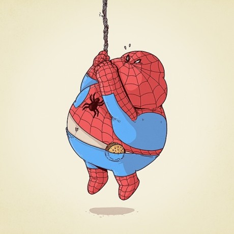
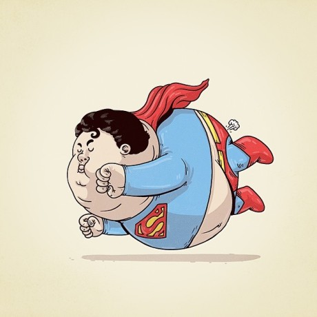
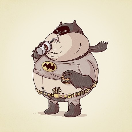
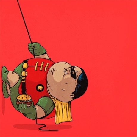
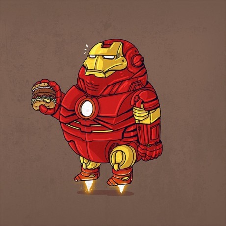
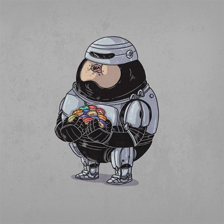
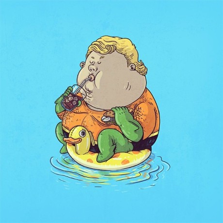
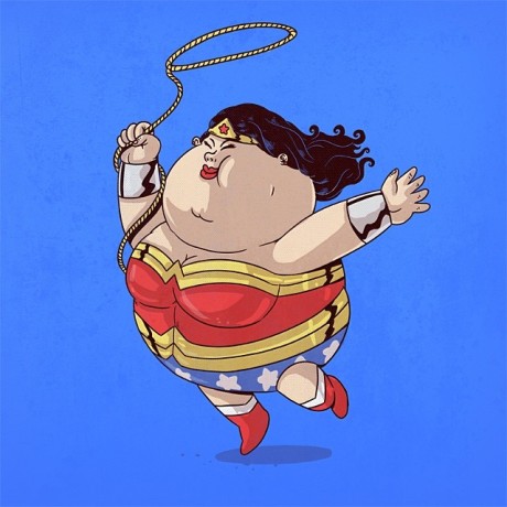
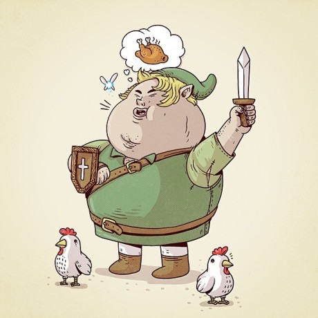
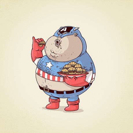
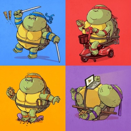
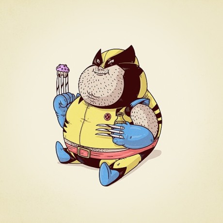
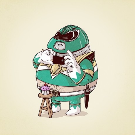
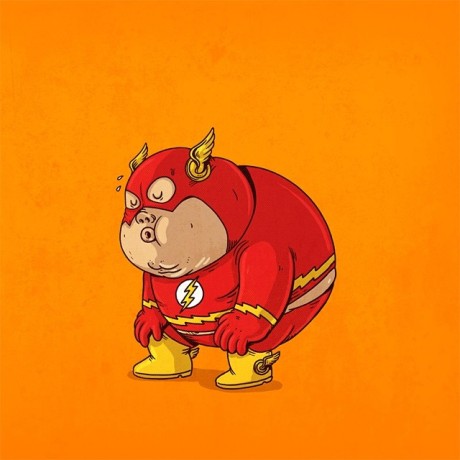
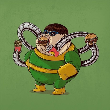
Superheroes are often revered not only for their remarkable abilities, but also their superior body types and physiques. Chicago-based artist/illustrator Alex Solis turns that perception on its head in this fantastically funny series (which has actually expanded beyond superheroes to feature #famouschunkies). We love how Solis captures the essence of each character, so they are instantly recognizable, but super-sizes their bodies in a strangely endearing way. Some might say that this vision is a more cerebral endeavorā€¦ social commentary on American culture and our obesity epidemic. But somehow, we think Solis is using his own super talents to invoke a little laughter into our day. Mission accomplished! We canā€™t wait to see more.

Via Instagram

Solis-01 Solis-02 Solis-03 Solis-04 Solis-05 Solis-06 Solis-07 Solis-08 Solis-09 Solis-10 Solis-11 Solis-12 Solis-13 Solis-14 Solis-15

French illustrator/designer Florian Nicolle employs mixed media to create wonderfully complex portraits that are so bold, yet nuanced, that they almost seem to move. With newsprint, watercolor, pencil, ink and Photoshop in his arsenal, Nicolleā€™s meticulously crafted chaos has been sought after by some pretty high profile clients, including Nike, Puma, Los Angeles Times and ESPN, among others. We love his style, and look forward to keeping an eye on his growing portfolio.

Via Behance

Nicolle-01 Nicolle-02 Nicolle-03 Nicolle-04 Nicolle-05 Nicolle-06 Nicolle-07 Nicolle-08 Nicolle-09 Nicolle-10 Nicolle-11 Nicolle-12 Nicolle-13 Nicolle-14 Nicolle-15 Nicolle-16 Nicolle-17 Nicolle-18 Nicolle-19 Nicolle-20 Nicolle-21 Nicolle-22 Nicolle-23 Nicolle-24

Chicago-based artist (and self-described ā€œagitatorā€) Mary Ellen Croteau has a body of work that spans over two decades. Her work has always challenged the ridiculousness of social norms, and her latest, constructed of non-recycled plastic waste, is no different. Influenced by Chuck Close, Croteau arranges thousands of bottle caps in their original color and size to reveal incredible compositions. But itā€™s not enough to be drawn in by the inventive repurposing of otherwise wasteful materialā€¦ Croteau is looking to shake things up a bit by demonstrating the huge amounts of trash we are consuming and sending into the environment. In her own words: ā€œI personally think that single-serve plastic bottles are a major curse on our environment, and most especially water bottles. Most of us do not need to have bottled water at hand. Getting people used to spending more money for water than they spend for a gallon of gasoline is devious and disastrous for the future of the planet, letting corporations control our water sources is evil.ā€ More work with resourcefully repurposed materials here and here and here.

Via maryellencroteau.net

Croteau-01 Croteau-02 Croteau-03 Croteau-04 Croteau-05 Croteau-06 Croteau-07 Croteau-08 Croteau-09 Croteau-10 Croteau-11 Croteau-12 Croteau-13