Archives for posts with tag: textures

We are compelled to check in on the work of renowned Russian illustrator/graphic designer Eiko Ojala every so often (here and here) because he’s just so good. Ojala’s style is distinct… we now recognize it from a mile away. These are truly mixed media endeavors, mixing digital illustration, paper textures, and both real and artificial shadows. His adept sense of color, composition and depth are hallmarks of his incredible body of work, which includes illustrations for a variety of impressive clients including The New York Times, National Geographic Traveler Magazine, Herman Miller, Harvard Business Review, Scientific American Mind, Ebony Magazine and The New Yorker. Here’s a sampling of some of his more recent work, including a children’s book he recently illustrated (available for purchase here). Enjoy.

Via ploom.tv

ojala-01 ojala-02 ojala-03 ojala-04 ojala-05 ojala-06 ojala-07 ojala-08 ojala-09 ojala-10 ojala-11 ojala-12 ojala-13 ojala-14 ojala-15 ojala-16 ojala-17 ojala-18 ojala-19 ojala-20 ojala-21 ojala-22 ojala-23 ojala-24 ojala-25

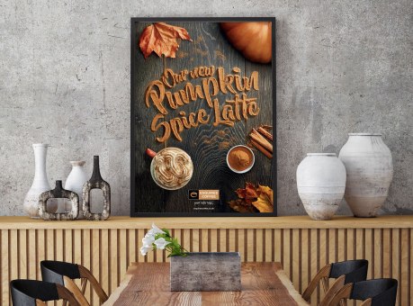
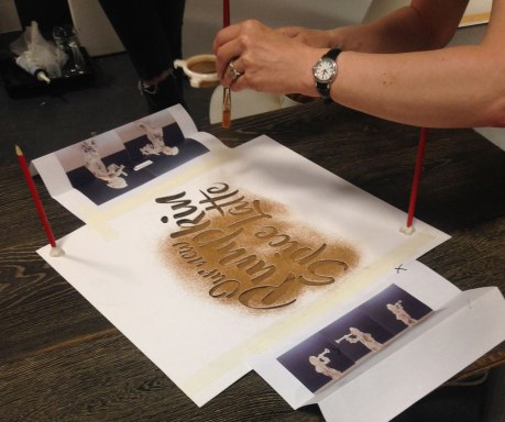
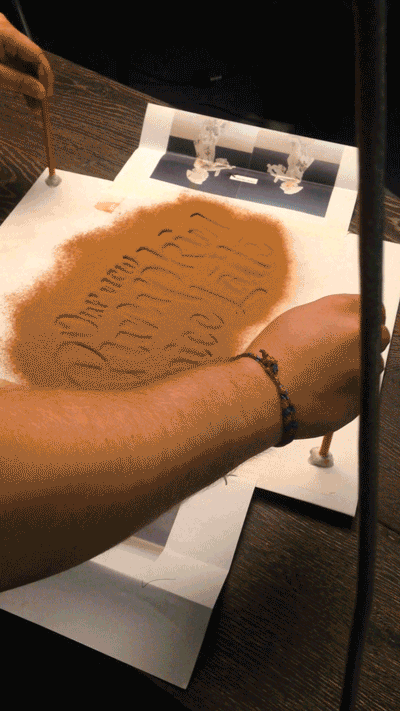
You must admit, the “pumpkin spice” phenomenon that has taken over in recent years may be getting bit out of hand. We find premature pumpkin spicing particularly offensive (as does this guy)… we do not need pumpkin spiced anything in August! In any case, with the autumnal flavors creeping in, so do all the colors, textures and visuals of the season. We love food-related typography (here and here and here), so when UK designer Daniel Coleman pulled back the curtain on his process for this fittingly delicious take on pumpkin spiced typography, we were immediately intrigued. In his own words, Coleman discusses the project: “Esquires’ Pumpkin Spice Latte is the coffee chain’s hero product for Autumn 2016. We were asked to produce a key visual that captured the Esquires brand points of being artisan and handmade, whilst conveying the products ingredients as authentic (and not just a syrup shot). We designed a visual that captured those standpoints, with a particular focus on the authentic ingredients. By creating the type out of cinnamon, we could emphasise the flavour in the latte. To further set the mood, we added leaves and key ingredients around the typography. We experimented with various ingredients, looking at what gave the greatest clarity, colour and perception of flavour. Given the nature of the product we decided to work with cinnamon. The type was created by adjusting a font named ‘Beyond the Mountains’, making sure it had no complete bowls, eyes or loops. The next step was to laser cut it out onto card to create our stencil. The final result took a few experiments, using varying amounts of cinnamon to ensure the best detail and legibility.”

Via Behance

coleman-01 coleman-02 coleman-03 coleman-04 coleman-05

When you (literally and figuratively) hold a magnifying glass up to some of nature’s more diminutive wonders, some breathtaking sights are revealed. We’ve seen artists examine mushrooms, sand and even the human eye. Naturalist photographer Samuel Jaffe’s thing is caterpillars. Having grown up in Eastern Massachusetts with a distinct curiosity about the world around him and a penchant for photography, Jaffe’s development of a project to raise and photograph native caterpillars seems natural. Jaffe’s documentation of a variety of caterpillars on black backgrounds not only highlight the beautiful patterns and textures from a scientific and investigatory standpoint, they also make exquisite photographs all on their own. You might even catch a hint of personality from these other-worldly creatures in Jaffe’s amazing shots.

Via samueljaffe.com

Jaffe-01 Jaffe-02 Jaffe-03 Jaffe-04 Jaffe-05 Jaffe-06 Jaffe-07 Jaffe-08 Jaffe-09 Jaffe-10 Jaffe-11 Jaffe-12 Jaffe-13

We are suckers for experimental typography, especially when it’s served up as a nice tidy alphabet. This outstanding series by Madrid-based designer Alejandro “Alex” López Becerro is one such example. Becerro is crazy talented, and his 3D work is on the mark. We love the variety that’s showcased here, which seems to be key to really successful avant-garde, if you will, alphabet work. His choice of textures and colors elevate this project. And we are particularly impressed with Becerro’s ability to establish a great sense of setting through light and shadow. Be sure to check out some of his other work, he’s a master at what he does.

More alphabet posts here and here and here.

Via Behance

Becerro-01 Becerro-02 Becerro-03 Becerro-04 Becerro-05 Becerro-06 Becerro-07 Becerro-08 Becerro-09 Becerro-10 Becerro-11 Becerro-12 Becerro-13 Becerro-14 Becerro-15 Becerro-16 Becerro-17 Becerro-18 Becerro-19 Becerro-20 Becerro-21 Becerro-22 Becerro-23 Becerro-24 Becerro-25 Becerro-26 Becerro-27 Becerro-28

When London-based designer Alexander Klement sets a personal design goal, he follows through in a big way. And his Lathe typeface is a shining example. As fellow designers, we understand that typeface design is no easy task. How do you create something fresh and new, when it has been done over and over in so many ways? Klement certainly created something we’ve never seen before. There’s great dimension to his figures, and we love how he explored various textures. Each character also stands quite nicely on its own. In his own words: “I decided not to design a typeface from scratch as there are so many great ones out there I could just add a personal touch to an existing one. I chose Futura as a base typeface for its simple, clean and modern characteristics. I started by creating a base generative extrusion which was applied to each character. Materials were then explored and applied to the characters to give a sense of a real life object.” Well done.

Via alexanderklement.co.uk

Klement-01 Klement-02 Klement-03 Klement-04 Klement-05 Klement-06 Klement-07 Klement-08 Klement-09 Klement-10 Klement-11 Klement-12 Klement-13 Klement-14 Klement-15 Klement-16 Klement-17

Not only are we huge fans of comedian Louie C.K., but this series of promo posters for his FX series are some of the best we’ve ever seen. Under the helm of supremely talented Los Angeles-based Turkish designer/creative director Ozan Karakoc, these posters transcend advertising… they are like individual works of art. We love the diverse layouts, and multitude of textures and typographic treatments. One is better than the other. Cue design envy music.

Via Behance

Karakoc-01 Karakoc-02 Karakoc-03 Karakoc-04 Karakoc-05 Karakoc-06 Karakoc-07 Karakoc-08 Karakoc-09 Karakoc-10 Karakoc-11 Karakoc-12