Archives for posts with tag: intrigued

Michigan artist and educator Anne Mondro has a fascination with human anatomy, so pairing that interest with her superb crocheting skills was a natural union. Using thin copper and steel wire, Mondro creates beautifully intricate crocheted sculptures of hearts, lungs, limbs, and even entire bodies. In her own words, Mondro states, “My creative work explores the physical and emotional complexity of the human body. Intrigued by the ways the human body is experienced and valued in society, I create sculptures and images that investigate and portray various aspects of humanity. Crocheting (the process of using a hooked needle to pull loops from a continuous thread and working with one stitch at a time) enables the figures to interlace each other physically and metaphorically to express these aspects of humanity. The color and texture of the wire adds to the work by portraying the figures as ethereal silhouettes, evoking associations with mortality and spirituality.” This is not your grandmother’s needlework, that’s for certain.

Via annemondro.com and ceresgallery.org

mondro-01 mondro-02 mondro-03 mondro-04 mondro-05 mondro-06 mondro-07 mondro-08 mondro-09 mondro-10 mondro-11 mondro-12

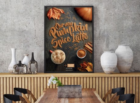
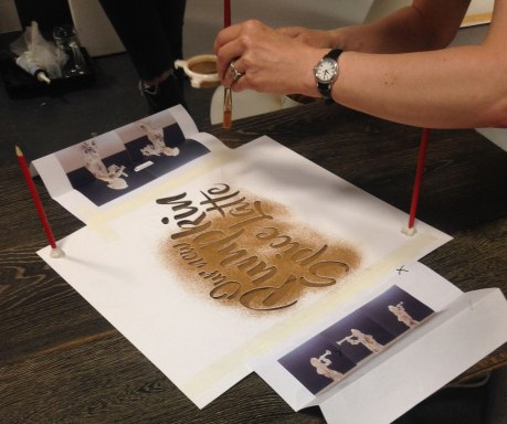
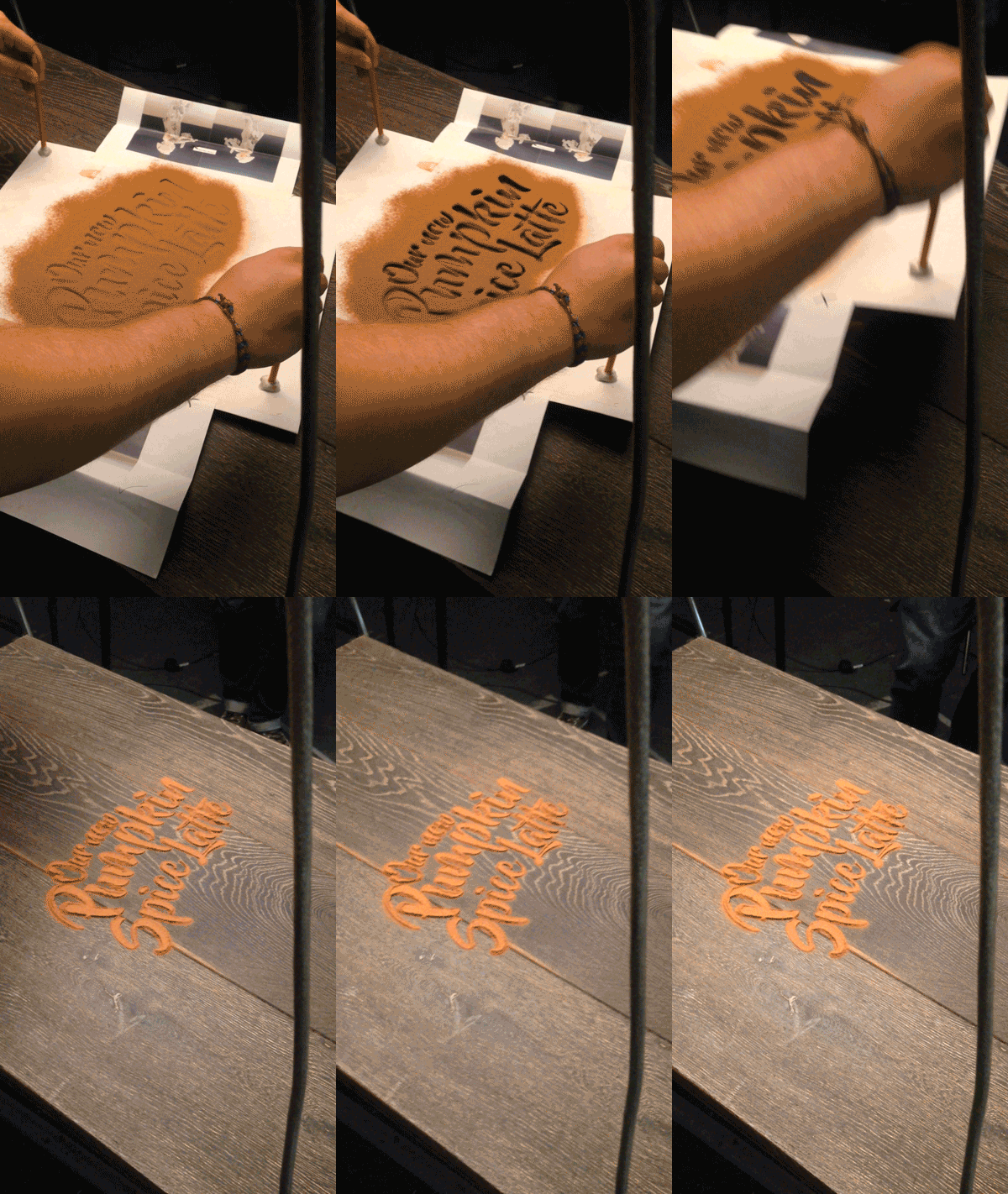
You must admit, the “pumpkin spice” phenomenon that has taken over in recent years may be getting bit out of hand. We find premature pumpkin spicing particularly offensive (as does this guy)… we do not need pumpkin spiced anything in August! In any case, with the autumnal flavors creeping in, so do all the colors, textures and visuals of the season. We love food-related typography (here and here and here), so when UK designer Daniel Coleman pulled back the curtain on his process for this fittingly delicious take on pumpkin spiced typography, we were immediately intrigued. In his own words, Coleman discusses the project: “Esquires’ Pumpkin Spice Latte is the coffee chain’s hero product for Autumn 2016. We were asked to produce a key visual that captured the Esquires brand points of being artisan and handmade, whilst conveying the products ingredients as authentic (and not just a syrup shot). We designed a visual that captured those standpoints, with a particular focus on the authentic ingredients. By creating the type out of cinnamon, we could emphasise the flavour in the latte. To further set the mood, we added leaves and key ingredients around the typography. We experimented with various ingredients, looking at what gave the greatest clarity, colour and perception of flavour. Given the nature of the product we decided to work with cinnamon. The type was created by adjusting a font named ‘Beyond the Mountains’, making sure it had no complete bowls, eyes or loops. The next step was to laser cut it out onto card to create our stencil. The final result took a few experiments, using varying amounts of cinnamon to ensure the best detail and legibility.”

Via Behance

coleman-01 coleman-02 coleman-03 coleman-04 coleman-05