Archives for the month of: April, 2015

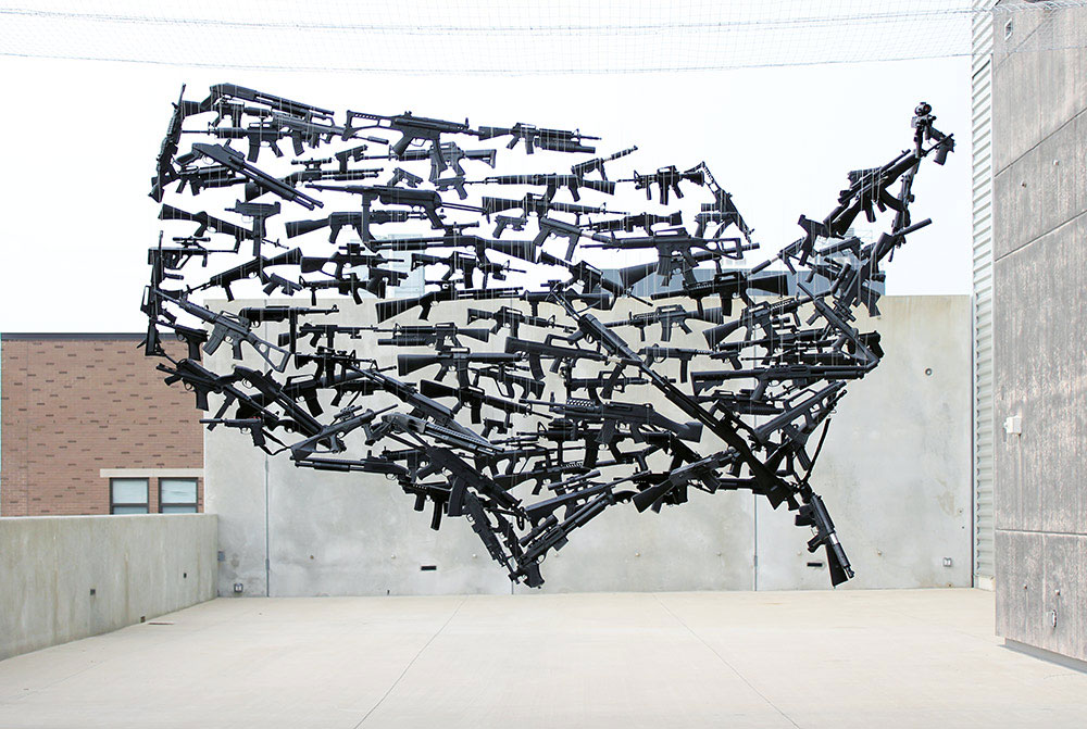
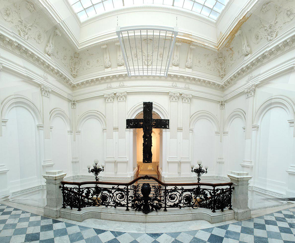
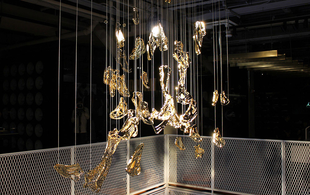
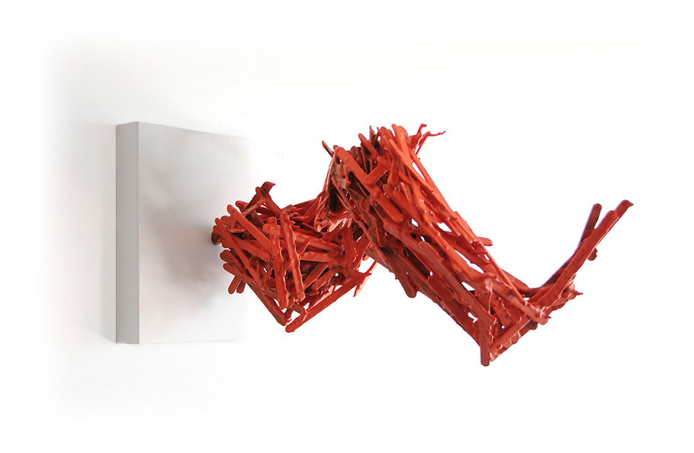
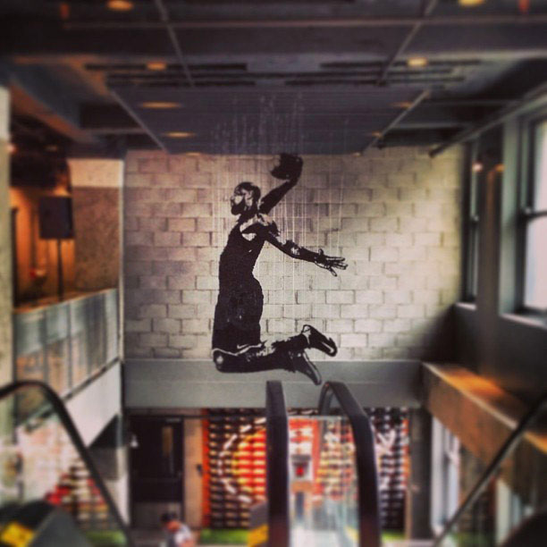
Some of the best, most thought-provoking art and design is best viewed from a variety of angles. In fact, the work of Brooklyn-based artist Michael Murphy relies on varying vantage points. Murphy’s large-scale, complex structures are profoundly awe-inspiring (these photos surely don’t do them justice, they are best viewed in person). His multi-layered, multi-dimensional sculptures consist of suspended objects that, when viewed from different perspectives, reveal something more. Murphy explains, “[my] large-scale works seek to dominate the viewer’s physical and mental space, captivating the critical thought process as one circles around the various entities that form a cohesive whole. Pieces initially experienced on a visually flat plane resonate with meaning upon closer inspection, opening up cerebral capacities to perpetual reconsideration. The mesmerizing effect of the varied angles and ingredients of [my] sculptures provoke thought, using aesthetic titillation as their gateway.” Murphy’s conceptual approach, paired with his calculated orchestration of these phenomenal installations, is a true marvel on a many levels. Wow.

Via mmike.com

Murphy-01 Murphy-02 Murphy-03

Murphy-04 Murphy-05 Murphy-06 Murphy-07 Murphy-08 Murphy-09 Murphy-10 Murphy-11 Murphy-12 Murphy-13 Murphy-14 Murphy-15

Murphy-16 Murphy-17 Murphy-18 Murphy-19 Murphy-20 Murphy-21

Murphy-22 Murphy-23 Murphy-24 Murphy-25 Murphy-26 Murphy-27 Murphy-28 Murphy-29

Food and color are two of our favorite things… combine that with very systematic arrangements, and we’re in seventh heaven. So when we stumbled upon the work of Seattle-based photographer/food fanatic Brittany Wright, we were immediately taken with her stunning compositions. Wright not only arranges fruit and vegetables in a spectrum that’s pleasing to the eye, but she also captures changes through the aging process, and sometimes cooking. Her approach is actually less like food photography, and more abstract. Wright’s terrific sense of color is clear in her very nuanced groupings. She has even branched out from fresh produce, and started exploring other types of foods too. Wright’s work appeals to us on a variety of levels, and if her growing number of Instagram followers is any indication, we’re not alone in that.

More orderly food photography here and here and here.

Via wrightkitchen.com and Instagram

Wright-01 Wright-02 Wright-03 Wright-04 Wright-05 Wright-06 Wright-07 Wright-08 Wright-09 Wright-10 Wright-11 Wright-12 Wright-13 Wright-14 Wright-15 Wright-16 Wright-17 Wright-18 Wright-19 Wright-20 Wright-21 Wright-22 Wright-23 Wright-24 Wright-25 Wright-26 Wright-27 Wright-28 Wright-29 Wright-30

Cubism, widely considered the most influential art movement of the 20th century, was pioneered by Picasso and Braque in the early 1900s. By definition, cubism is a style and movement in which perspective with a single viewpoint was abandoned and use was made of simple geometric shapes, interlocking planes, and even collage. Dutch artist Enno de Kroon takes this one step further, using the unique landscape of the universal egg carton to his advantage in what he calls “eggcubism”. de Kroon had always experimented with distortions of perspective, and he found that the egg carton as his canvas presented a new and unique challenge that forced him to approach painting in a new way. The challenge is not only limited to de Kroon as the creator, but the viewer’s perception is also challenged. de Kroon explains, “The waves of the egg cartons limit the viewer’s perception; they also make him aware of his positioning towards the image. The intentional limitation in subjective perception gives room for imagination and recall: the process of occlusion. By a fusion of direct and indirect perception conventional imagery is overtaken. At first sight this leads to a physical and mental incompleteness, that forces an integration which can only take place within the inner experience, apart from time and space. One could say that the complete image just emerges sublimated in the viewers mind. Gestalt psychology states that human perception aims for completeness. Perceptions are being added subconsciously. My eggcubist works evoke conscious and dynamic adding. The objects not only refer to themselves, they also refer to each other as a series.” In a digital age of augmented reality and immersive 3D experiences, de Kroon’s eggcubism pays homage to traditional cubism, with an interactive twist.

Via ennodekroon.nl and Flickr

deKroon-01 deKroon-02 deKroon-03 deKroon-04 deKroon-05 deKroon-06 deKroon-07 deKroon-08 deKroon-09 deKroon-10 deKroon-11 deKroon-12 deKroon-13 deKroon-14 deKroon-15 deKroon-16 deKroon-17 deKroon-18 deKroon-19 deKroon-20 deKroon-21 deKroon-22 deKroon-23 deKroon-24

It’s been a week now, and we’re still stimulated by our experience at Create Upstate (related posts here, here, here and here). One unexpectedly enlightening address, Anatomy of a Maker, was given by Dora Drimalas, Principal of San Francisco-based Hybrid Design. Drimalas, along with her husband Brian Flynn, is at the helm of this full-service creative agency. Not many firms can tout a client list as impressive as Hybrid’s: Nike, Disney, Apple, Microsoft, Sony and Yahoo, to name a few. One might assume with such corporate powerhouse clientele, the leadership at Hybrid would be solely focused on churning out work at a breakneck pace to meet countless and differing demands. While client needs are certain a priority at Hybrid, Drimalas and Flynn seem to have a distinct passion for the timeless craft of design. This creative spirit doesn’t necessarily oppose a frame of mind needed to manage corporate demands, but certainly bucks a stereotype. When global paper manufacturer Mohawk approached Hybrid a couple years ago to reevaluate their perspective on paper in an increasingly digital world, Drimalas and company drew from their personal enthusiasm, philosophy and high regard for the heritage of craftsmanship. With that partnership, Mohawk Maker Quarterly was born. It’s much more than an indulgent paper promotion, it’s a publication with real substance. Drimalas spoke to the content within the latest issue (No. 6) with great fervor, explaining that the relatively recent dominance and ephemeral nature of digital communication positions print communication, like many other time-honored aspects of art and culture, at an elevated level. With a swing of the cultural pendulum, printers and designers are once again craftspeople, reminiscent of the Arts and Crafts movement over a century ago. It’s what Drimalas referred to as Arts and Crafts 2.0. The morsals of food for thought that Drimalas posed are too numerous to mention here. We were inspired not only by the content of Drimalas’s discourse, but also by the flawless design and printing of the Maker publication. Contact your paper rep if you do not have one of these in your hands.

Via hybrid-design.com and mohawkconnects.com

Drimalas-01 Drimalas-02 Drimalas-03 Drimalas-04 Drimalas-05 Drimalas-06 Drimalas-07

Balancing work and family is an issue close to our hearts. The culture at Barbour fosters this balance brilliantly, so we listened intently when Amanda Altman of Rochester-based A3 Design took the stage at Create Upstate (see related posts here, here and here) last week. Her speech, entitled Mind My Own Business, explored the ins and outs of Altman’s experiences of not only running, but also refocusing and repositioning, a design studio with her husband, Alan. And all while juggling the demands of marriage and family. We were taken with Altman’s sincerity and candor on a subject that’s not often brought to the forefront. If her articulation was any indication, Altman could honestly have a second career as a life coach for creatives. If we had to choose a highlight, this frank pearl of wisdom pretty much sums it up: “Do what you love and you’ll never work a day in your life… bullshit!”

Altman made a smart choice to show “pretty pictures” of A3’s outstanding body of work while speaking (scroll down for a sampling). Needless to say, the Altmans seem to be balancing masterfully. Really well done.

Via a3-design.com

A3-01 A3-02 A3-03 A3-04 A3-05 A3-06 A3-07 A3-08 A3-09 A3-10 A3-11 A3-12 A3-13 A3-14 A3-15 A3-16 A3-17 A3-18 A3-19 A3-20 A3-21 A3-22 A3-23 A3-24 A3-25 A3-26 A3-27 A3-28 A3-29 A3-30

In keeping with our (hopefully) weeklong theme of Create Upstate 2015 (other posts here and here), we turn the spotlight on fellow Rochester-based designer (and educator/writer) Mitch Goldstein. Those behind the planning of Create Upstate clearly made a deliberate decision to have Goldstein kick off the main event. Goldstein is the perfect blend of adept designer and engaging speaker, and his talk about The Habit of Making got us charged up right out of the box. It almost felt like church for designers, and Goldstein was giving a homily. In essence, Goldstein discussed his habit of making for the sake of making, and how it has made him a better designer. This daily 30-minute creative exercise, which he and his wife Anne Jordan call “inside walking”, has given way to some pretty impressive work (below and here). Goldstein stressed the importance of letting go, and not worrying about making something “good” or even “finished”, but just focus on the making part. We are not really doing Goldstein’s sermon any justice here, just know that this is sage advice that we hope to get into the habit of following. Be sure to scroll down for products from Goldstein’s “walks”, and a sampling of his superb client work, some of which originated directly from said walks.

Via mitchgoldstein.com and Tumblr

Goldstein-01 Goldstein-02 Goldstein-03 Goldstein-04 Goldstein-05 Goldstein-06 Goldstein-07 Goldstein-08 Goldstein-09 Goldstein-10 Goldstein-11 Goldstein-12 Goldstein-13 Goldstein-14 Goldstein-15 Goldstein-16 Goldstein-17 Goldstein-18 Goldstein-19 Goldstein-20 Goldstein-21

Continuing the theme of our fantastic experience at Create Upstate last week in Syracuse (previous post here), we’d like to introduce you to Curtis Canham of CSA Creative Studio. Canham is an art director/designer/educator based in the Albany area with an impressive and diverse portfolio, from sophisticated packaging to illustration-driven infographics to consumer-facing web design. Along with running a full service design studio, Canham also finds the time to educate the next generation of designers as a design professor at The Center for Art and Design at The College of Saint Rose in Albany. With all of this important work, Canham, believe it or not, is also working on publishing a fundamental typography book. Busy guy, indeed. Last week, Canham ran a table in the marketplace at Create Upstate extolling the virtues of a-holes that quickly caught our attention. A-holes? What the what!? Canham drew us in with his impassioned discourse about his forthcoming book, A-holes: A Type Book. He enlightened us on such things as the anatomy of a-holes, historic a-holes, famous a-holes. and families of a-holes. All of this perceived potty talk may elicit gasps from those who don’t know any better. But being the typography nerds that we are, we, of course, understand and appreciate the double entendre. Aside from the obvious, an a-hole is also the negative space, or counter, within the “A” characters. Canham’s book taps right into a brand of humor we Barbour folk love. With only 5 days left, Canham is in the home stretch of a Kickstarter campaign to fund a first printing of his 130-page book. Don’t be an a-hole… pledge a few bucks, please.

Via csacreativestudio.com and Kickstarter

Canham-01 Canham-02 Canham-03 Canham-04 Canham-05 Canham-06 Canham-07


Gabe was particularly taken with all of this, and his name was fittingly drawn for an A-hole t-shirt at Create Upstate! In his own words, “you are what you wear.” Bahahahahaha!

Canham-09 Canham-10Canham-08

A couple members of the Barbour team had the honor of witnessing a speaking engagement by the incomparable Dana Tanamachi at Create Upstate in Syracuse last week. The event itself was terrific, from the impressive venue (great food, btw), awesome vendors, and stellar lineup of speakers. One highlight was undoubtedly the inspirational work and philosophy of Tanamachi. Honestly, we’re not saying anything new here, just bowing down, as most who are exposed to her transcendent work tend to do. Texas-bred, Brooklyn-based Tanamachi, whose lettering work is quite ubiquitous (you’ve probably seen it, or a rip-off of it, and may not have realized it was hers), seems quite gracious, humble, passionate and sincere when discussing her craft. She’s not some Brooklyn hipster who is too cool for school. Her tremendous talents seemed to have emerged over time, and her rise in the design world happened organically, which we truly admire. Tanamachi is a rock star among our peers, and we are just happy to have spent an engaging hour in her presence. Here’s a small sampling of her formidable body of work… prepare to drool.

Via tanamachistudio.com

Tanamachi-01 Tanamachi-02 Tanamachi-03 Tanamachi-04 Tanamachi-05 Tanamachi-06 Tanamachi-07 Tanamachi-08 Tanamachi-09 Tanamachi-10 Tanamachi-11 Tanamachi-12 Tanamachi-13 Tanamachi-14 Tanamachi-15 Tanamachi-16 Tanamachi-17 Tanamachi-18 Tanamachi-19 Tanamachi-20 Tanamachi-21 Tanamachi-22 Tanamachi-23 Tanamachi-24 Tanamachi-25 Tanamachi-26 Tanamachi-27 Tanamachi-28 Tanamachi-29 Tanamachi-30 Tanamachi-31 Tanamachi-32 Tanamachi-33

Spring is in the air (sorta), and with summer just around the corner, we thought a beach-related post was in order. A favorite pastime of many is spending warm sunny days building sand castles on the beach. They take many forms, from bucket molds, to deep moat formations, to the ubiquitous drip castle. A Massachusetts artist simply known as SandCastleMatt creates incredible sand structures that stand out from the rest. What’s unique about Matt’s work is that his designs almost look organic, like they naturally emerge from the beach. Using found objects, like sticks, vines, wood and other repurposed junk, Matt builds a framework to support his structures. Then he employs the classic drip method, which conceals the bones of his impressive ephemeral work. a few years back, a viral photo mistakingly identified one of his structures as the result of a lightening strike in the sand, which was later debunked by Scientific American (here).

Via Flickr and Vimeo

SandCastleMatt-01 SandCastleMatt-02 SandCastleMatt-03 SandCastleMatt-04 SandCastleMatt-05 SandCastleMatt-06 SandCastleMatt-07 SandCastleMatt-08 SandCastleMatt-09 SandCastleMatt-10 SandCastleMatt-11 SandCastleMatt-12 SandCastleMatt-13 SandCastleMatt-14 SandCastleMatt-15

Voyeurism is a term we use loosely here, more referring to human curiosity than anything perverse in nature. But it seems to be the best way to describe the work of Dutch documentary photographer Reinier Gerritsen in his series The Last Book. Over the course of three years, Gerritsen trolled the New York City subway system, observing and documenting the printed matter commuters were reading. With the decline of physical books in favor of digital media, his original intention was to chronicle the waning days of traditional publishing: “Conceived as an elegy to the end of bound books, in a positive twist it has now become evident that people are moving away from electronic reading devices and that the printed book is alive and well!” With the rigor of a sociological experiment, Gerritsen catalogued hundreds of photos on his website by author’s last name. “It began as a series of modest observations and transformed into a collection of vivid documentary portraits, set against a visual landscape of best sellers, classics, romance novels, detective thrillers and every kind of printed book, as diverse as the readers.” Gerritsen took note of patterns, observing that Suzanne Collins, James Patterson and J.K. Rowling were among the most popular authors of choice. This project was eventually published into a beautiful bound book itself (available here), and Gerritsen even headed back underground to photograph commuters with their e-readers for his own digital publication, an app called The Last Book Revisited (available here).

Via reiniergerritsen.nl and saulgallery.com

Gerritsen-01 Gerritsen-02 Gerritsen-03 Gerritsen-04 Gerritsen-05 Gerritsen-06 Gerritsen-07 Gerritsen-08 Gerritsen-09 Gerritsen-10 Gerritsen-11 Gerritsen-12 Gerritsen-13 Gerritsen-14 Gerritsen-15 Gerritsen-16 Gerritsen-17 Gerritsen-18 Gerritsen-19 Gerritsen-20