Archives for category: Retail

Resemblance is a funny thing (previous post here). Like the notion that cars have faces (here). Or the dog with a human face that has taken the internet by storm (here). Sort of along those lines, British photographer (and animal lover) Gerrard Gethings recently completed a series where he paired dogs and humans, and we absolutely love it. This series is so fun, in fact, that the concept actually derived from a commission by British publisher Laurence King Publishing for this brilliant little matching game (available here). Make no mistake, this was not an easy task. According to Gethings (and he would know based on his impressive portfolio), “taking pictures of animals is tricky in almost every way. I have never met one with even the slightest interest in photography.” Fortunately, we have a strong interest in this terrific and endearing series.

Via gerrardgethings.com and Instagram

At a time when our collective consciousness is so acutely aware of gender roles, and (a long overdue) war has been waged against sexist practices and other gender issues, Lebanon-based photographer/visual artist Eli Rezkallah turns twisted gender roles depicted in vintage advertisements on their heads. Rezkallah painstakingly recreated some blatantly sexist ads, but with a reversal of gender roles to convey just how these absurd and deep-rooted gender stereotypes were portrayed to the masses just decades ago. Rezkallah also comments on how past generations continue to perpetuate these oversimplified ideas about the roles of women and men: “Last Thanksgiving, I overheard my uncles talk about how women are better off cooking, taking care of the kitchen, and fulfilling ‘their womanly duties’. Although I know that not all men like my uncles think that way I was surprised to learn that some still do, so I went on to imagine a parallel universe, where roles are inverted and men are given a taste of their own sexist poison.” If nothing else, Rezkallah’s work should make you giggle (and perhaps even gasp).

Via elirezkallah.com


Melbourne, Australia-based contemporary artist Ben Frost has a pop art aesthetic with a subversive, confrontational spirit. In some of his most recent work, Frost essentially uses mainly (junk) food and pharmaceutical packaging as a canvas for his bold illustrations inspired by pop culture, Roy Lichtenstein, and manga. His mashups are not random, though… Frost exhibits his mastery of juxtaposition with these works in a way that can be truly provocative. Through his work, Frost continually pushes boundaries and challenges social norms while addressing our advertising-soaked, consumer-obsessed culture. In his own statement, Frost describes: “By subverting mainstream iconography from the worlds of advertising, entertainment, and politics, he creates a visual framework that is bold, confronting and often controversial.”

Via benfrostisdead.com

Oh, experimental typography… how we love thee. Perhaps it’s a case of design envy, or we’re just taken with pretty things in general, but when done well, experimental typography can stand on its own, out of context. This is definitely the case with the work of Hamburg, Germany-based motion designer/illustrator Alex Schlegel. Schlegel’s visual explorations on the typographic treatment for DirecTV’s Super Saturday Night lead to these impressive pieces. The forms, lighting, and textures achieved with Maxon Cinema 4D are not only purposeful but also beautiful. Designers can sometimes use such powerful tools gratuitously, but Schlegel’s steady hand and keen eye for composition and color elevate this client job for corporate giant AT&T to works of art.

Via Behance

In an effort to pay homage to some superb Italian design manifested widely through consumer goods, Italian-American designer Gianluca Gimini conceived this series of fictional co-branded sneakers. Looking at Gimini’s body of work, particularly this imaginative series, appropriately titled “Sneakered”, it’s clear that Gimini operates on a creative plane not easily defined. At a time when consumers (very broadly speaking) seem to be steeped in the marketing of nostalgia, Gimini capitalizes on that trend and also taps into a youth culture that holds footwear, specifically sneakers, in high regard. Think of it as an exercise in mashing up historical examples of excellent product design with a vehicle that has global youth appeal (sneakers). Brilliant.

Via Behance

gimini-01 gimini-02 gimini-03 gimini-04 gimini-05 gimini-06 gimini-07 gimini-08 gimini-09 gimini-10 gimini-11 gimini-12 gimini-13 gimini-14 gimini-15 gimini-16 gimini-17 gimini-18 gimini-19 gimini-20 gimini-21

Believe it or not, for being such a simple, uncomplicated product, Lego has some particularly clever and thought-provoking advertisements (here and here). Already three years old, this campaign celebrating 55 years of the Lego brand is basically a series of 55 visual riddles, fittingly featuring little more than the iconic bricks. The great minds at Swiss agency Cavalcade are behind these fantastically clever designs, which, much like Legos themselves, inspire a great deal of imagination. We must admit, we’re still struggling to solve many of these, but it’s so satisfying having solved the ones we did. Answer key to the few ads featured here at the bottom of this post. No peeking, try to figure them out for yourself!

Via Behance

cavalcade-01 cavalcade-02 cavalcade-03 cavalcade-04 cavalcade-05 cavalcade-06 cavalcade-07 cavalcade-08 cavalcade-09 cavalcade-10 cavalcade-11 cavalcade-12 cavalcade-13 cavalcade-14 cavalcade-15 cavalcade-16 cavalcade-17 cavalcade-18 cavalcade-19 cavalcade-20 cavalcade-21 cavalcade-22

Answers (in order of images): Yellow Submarine, Alice in Wonderland, Three Little Pigs, Purple Rain, Jaws, Spider-Man, The White Stripes, Hunger Games, Four Weddings and a Funeral, Bob Marley and the Wailers, Goldilocks and the Three Bears, Jackson 5, King Kong, Titanic, Stairway to Heaven, I Walk the Line, The Beatles, New Kids on the Block, Little Red Riding Hood, Clockwork Orange, Men in Black, Rolling Stones

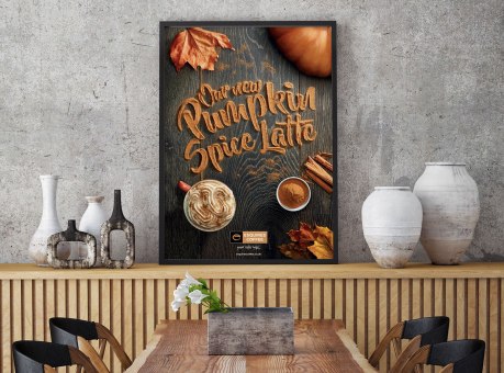
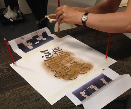
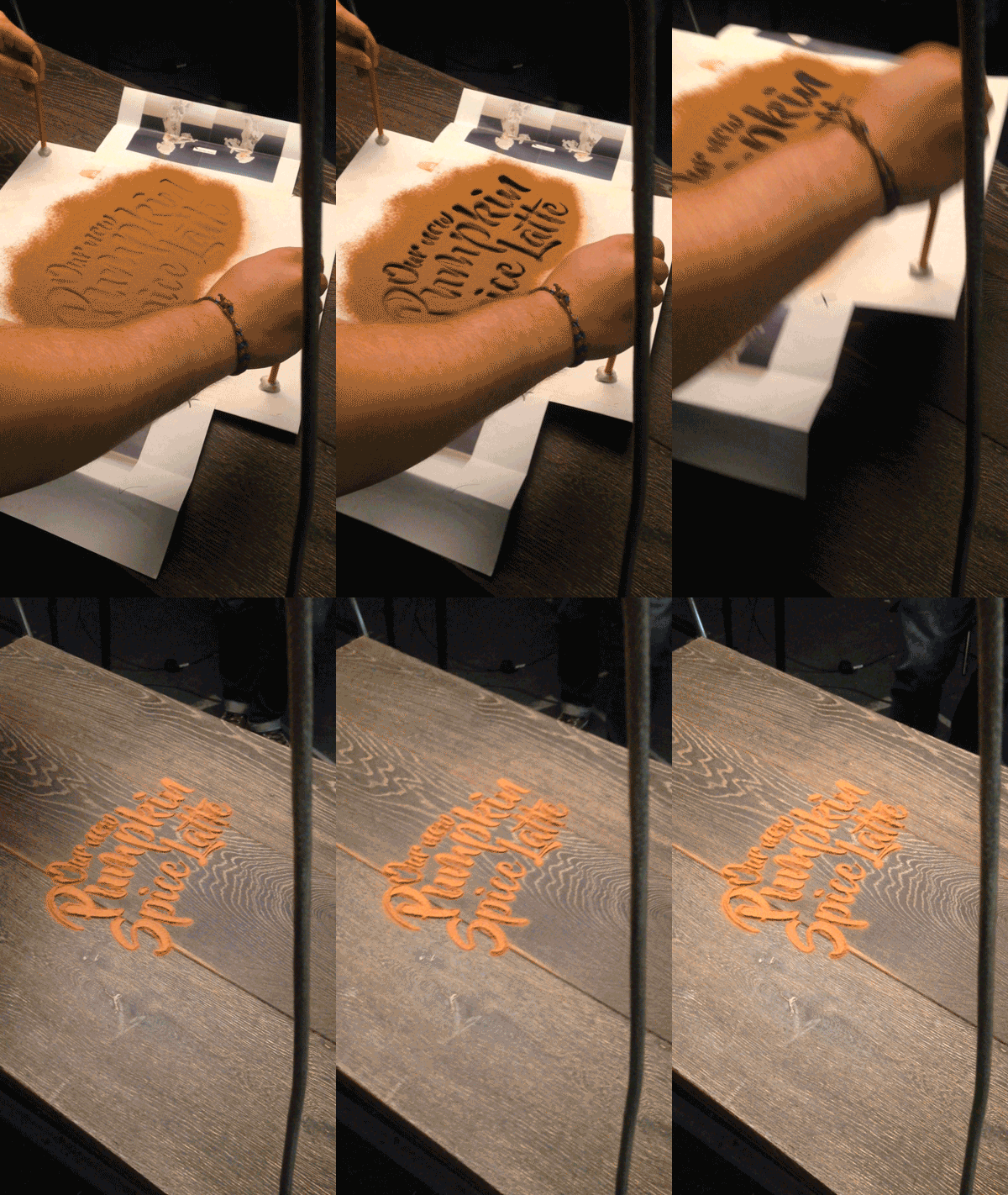
You must admit, the “pumpkin spice” phenomenon that has taken over in recent years may be getting bit out of hand. We find premature pumpkin spicing particularly offensive (as does this guy)… we do not need pumpkin spiced anything in August! In any case, with the autumnal flavors creeping in, so do all the colors, textures and visuals of the season. We love food-related typography (here and here and here), so when UK designer Daniel Coleman pulled back the curtain on his process for this fittingly delicious take on pumpkin spiced typography, we were immediately intrigued. In his own words, Coleman discusses the project: “Esquires’ Pumpkin Spice Latte is the coffee chain’s hero product for Autumn 2016. We were asked to produce a key visual that captured the Esquires brand points of being artisan and handmade, whilst conveying the products ingredients as authentic (and not just a syrup shot). We designed a visual that captured those standpoints, with a particular focus on the authentic ingredients. By creating the type out of cinnamon, we could emphasise the flavour in the latte. To further set the mood, we added leaves and key ingredients around the typography. We experimented with various ingredients, looking at what gave the greatest clarity, colour and perception of flavour. Given the nature of the product we decided to work with cinnamon. The type was created by adjusting a font named ‘Beyond the Mountains’, making sure it had no complete bowls, eyes or loops. The next step was to laser cut it out onto card to create our stencil. The final result took a few experiments, using varying amounts of cinnamon to ensure the best detail and legibility.”

Via Behance

coleman-01 coleman-02 coleman-03 coleman-04 coleman-05

Legos and art have been crossing paths for years now (here and here and here). These colorful bricks that come in a vast spectrum of colors inspire not only young children, but also creative-thinking adults the world over. We are in awe of this brilliant ad campaign for Lego from a few years back, featuring highly minimalistic configurations of single-stud bricks depicting some of the most iconic paintings by masters from da Vinci to van Gogh. The human brain is truly intriguing. The fact that most people would recognize these works of art, with mere hints of details, really is amazing when we think about it. Kudos to Milan-based art director Marco Sodano for the clever concept and flawless execution.

Via Behance

sodano-01 sodano-02 sodano-03 sodano-04 sodano-05 sodano-06 sodano-07 sodano-08 sodano-09 sodano-10 sodano-11 sodano-12

We have a certain fondness for Scandinavian design; what’s not to love when functionality and simplicity converge? These characteristics extend through many facets of design, including architecture, furniture, household objects, and, of course, photography and graphic design. So it’s no wonder we’re so taken with this series of photographs by Danish photographer Mikkel Jul Hvilshøj. Commissioned by iconic, high-end Danish housewares brand Eva Solo, Hvilshøj captured these fantastic “visual recipes” in such a way that they could honestly stand on their own based on artistic merit. Hvilshøj’s work elevates marketing photography to another level. We not only love the concept, but it’s executed brilliantly.

Via hvilshoj.com

hvilshov-01 hvilshov-02 hvilshov-03 hvilshov-04 hvilshov-05

Transforming everyday objects into art holds a special place for us. It harkens back to childhood thoughts, when our minds wandered while staring out the car window at cloud formations that looked like other things. Or when we’d doodle with no purpose other than to document our own whimsical musings. These days, artists apply conceptual thinking to this cherished pastime, and the results are often special and surprising (here and here and here). Included among those artists is German-born, Australian-based Domenic Bahmann (aka Domfriday). What started as a personal exercise in creative thinking has since populated his Instagram page, which piques the interest of almost 60K followers. And, in turn, has even led to retail opportunities due to popular demand (here and here). In his own words, Bahmann explains: “In 2013 I started my own creative challenge called ‘Stop, Think, Make’. I had to come up with a new image or illustration at least once a week. Since then I try to see the world in the way I used to when I was a child. Staying playful and curious isn’t always easy in our busy modern world.”

Via Instagram

Bahmann-01 Bahmann-02 Bahmann-03 Bahmann-04 Bahmann-05 Bahmann-06 Bahmann-07 Bahmann-08 Bahmann-09 Bahmann-10 Bahmann-11 Bahmann-12 Bahmann-13 Bahmann-14 Bahmann-15 Bahmann-16 Bahmann-17 Bahmann-18 Bahmann-19 Bahmann-20 Bahmann-21 Bahmann-22 Bahmann-23 Bahmann-24 Bahmann-25