Archives for category: Inspiration

Disney characters are so ubiquitous in today’s popular culture that they are sometimes the subject of a less wholesome narrative (as seen here and here). In his series Noir Princesses, San Diego-based illustrator/artist Astor Alexander explores Disney princesses in a darker light. These highly stylized portraits harken back to mystery novels and films of the 1940s and 50s and tell stories centered around said princesses as noir fiction protagonists. Alexander’s talent is undeniable, and his aesthetic is right on the money. He captures the individual personality of each recognizable princess character while transporting them all to a less familiar setting with a foreboding cinematic quality.

Prints available here.

Via Behance and Instagram

When one thinks of hand embroidery, a little old lady in her rocker with a wooden hoop on her lap sewing “Home Sweet Home” may immediately come to mind. Young Malaysian artist Sheena Liam turns that notion of traditional hand embroidery on its head with her simple yet smart creations. Using little more than black thread and her own imagination and experiences, Liam adds another dimension to what is traditionally a two-dimensional art. Hair is the focal point of Liam’s work, and her subjects’ long tresses flowing from her circular canvases is her signature. This clever touch elevates her work, and we absolutely love it.

Via Instagram


Graffiti as we know it is a little less radical these days, much to the disappointment of some. Now sometimes referred to as street art, it has been elevated to just that: art. And with this new cultural regard comes greater exposure. We recently stumbled upon the work of Portuguese artist Sergio Odeith thanks to said exposure, and there is no doubt that his skills are highly artistic, “street” or otherwise. Odeith plays with our minds with his large-scale anamorphic creations he likes to call “sombre 3D”. His sense of space and perspective are astounding, with flawless artistic skills to match. Some of his works are straight up creepy, but that’s probably the point.

More street art posts here and here and here.

Via odeith.com and Instagram


Resemblance is a funny thing (previous post here). Like the notion that cars have faces (here). Or the dog with a human face that has taken the internet by storm (here). Sort of along those lines, British photographer (and animal lover) Gerrard Gethings recently completed a series where he paired dogs and humans, and we absolutely love it. This series is so fun, in fact, that the concept actually derived from a commission by British publisher Laurence King Publishing for this brilliant little matching game (available here). Make no mistake, this was not an easy task. According to Gethings (and he would know based on his impressive portfolio), “taking pictures of animals is tricky in almost every way. I have never met one with even the slightest interest in photography.” Fortunately, we have a strong interest in this terrific and endearing series.

Via gerrardgethings.com and Instagram

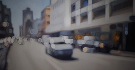
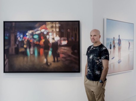
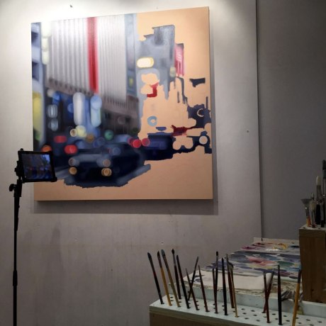
We always find it interesting when artists figuratively blur the lines of media, and in this case literally. The work of South African artist Philip Barlow appears to be one thing but is actually another, and we are utterly intrigued. What looks like beautifully composed out-of-focus photographs are actually masterfully created oil paintings. Barlow focuses (no pun intended) on the interaction of light with his subjects, and the results are quite stunning. In his own words, “The figures in the landscape serve as carriers and reflectors of the light that falls upon them. Bathed in the luminosity, it is my hope that they would become more beautiful. To me, light is the ultimate subject because it embodies the pinnacle of all reality.” In works where the details are not at all sharp, we are taken with Barlow’s astounding attention to detail. The soft edges and bokeh effect are quite beautiful, and Barlow’s deep understanding of color is an artistic revelation. We are in awe.

Via philipbarlow.com and Instagram

We can all agree that the 1980s had a very specific aesthetic that proliferated into all areas of our culture, from fashion to music to graphic design and everything in between. So when digital artist/musician/internet persona Future Punk recently took some, ahem, very recognizable brands and gave them an 80s-styled retro makeover, we swooned. Future Punk (we’ve unsuccessfully scoured the internet for any clues as to his/her true identity) employs an arsenal of 1980s mainstays, including neon, chrome and Memphis-style elements to take current brand logos back to the future. Future Punk could honestly continue this great series for quite sometime… here’s to hoping!

Via future-punk.com

We particularly love when artists give everyday objects new context. Not only does this type of work capitalize on the element of surprise, but it also gives the viewer a glimpse into a creative mind. Artists who create these works (some past features here and here and here) see the world from a unique perspective. As is the case with self-proclaimed “Fantasy Researcher” Diego Cusano. Cusano, who has a background in visual arts and graphic design, explores the use of simple everyday objects in unexpected and creative ways. And so much so, in fact, that some high profile clients have taken notice and hired him for various campaigns, including Warner Bros., Adidas, Diesel, Dior, Cartier, Haribo, among others. In his own words, Cusano explains his work: “I started watching things from a different point of view, and from this new approach, I started creating the illustrations that, since then, I’m publishing each day on the social networks. Objects change their native function through the graphic to a new, different, unpredictable function. I always try to “re-invent” myself. I would like to give smiles when people look at my works.” It’s safe to say Cusano’s objective is on-point and wildly successful. His work definitely brings smiles to our faces.

Via diegocusano.com and Instagram

It’s no secret that we love admiring typographic projects (here and here and here). When we came across this gem from German studio/duo FOREAL (previously featured here), which harkens back to childhood memories filled with cartoon references, we were immediately drawn in. We absolutely love this series and the sheer variety FOREAL was able to employ. While each letterform is vastly different, they all work nicely as a set. As for the 36 Days of Type design challenge that sparked this series in the first place, FOREAL absolutely killed it. Quite simply, #designenvy. This is just a sampling, be sure to check out the entire collection on FOREAL’s Instagram (here).

Via weareforeal.com

At one time or another, we’ve all experienced the satisfaction of a perfectly timed photo. Being in the right place at the right time can be everything. Just ask Missouri-bred, New York-based photographer Jonathan Higbee, who capitalizes on those moments in his outstanding series “Coincidences.” Described as his “love letter to New York, and to the infinite number of magical, ephemeral and serendipitous moments that make it a city unlike any other,” Higbee credits his awe-inspiring collection of moments to exploring the streets of the Big Apple for over a decade. In his own words, Higbee explains, “This work explores the relationship city dwellers share with their chaotic, demanding urban environments. The pervasive and growing sources of overstimulation (giant glowing advertisements, traffic sounds, odors from food carts, etc.) all fight for the precious attention of passersby. “Coincidences” attempts to stabilize this instability and reveal the uncanny stories that arise when the crush of urban discord experiences brief moments of harmony.” Higbee’s work is harmonious, indeed… striking all the right chords from masterful composition to that element of surprise and delight, and often humor. Keep an eye out for Higbee’s forthcoming book featuring never before seen work!

Via Instagram